


Blue is deceptively difficult. What reads as a sophisticated slate in one moment can shift entirely when sunlight hits – suddenly leaning icy, chalky, or far more playful than intended. It’s why so many homeowners find themselves staring at endless variations of “Pale Sky,” unsure which version will actually behave once it’s on the wall.
At Toledo Geller, we spend a great deal of time understanding not just what a color looks like, but why it behaves the way it does. Light exposure, orientation, surrounding materials, and architectural context all play a role. This balance between intuition and analysis is central to what we call The TG Method – where the art of design meets the science of how a room truly lives.
Over time (and after many sample pots), a small group of blue paint colors has earned our trust. These are the shades we return to again and again – blues that feel refined rather than trendy, adapt beautifully to their surroundings, and elevate a space without overpowering it.
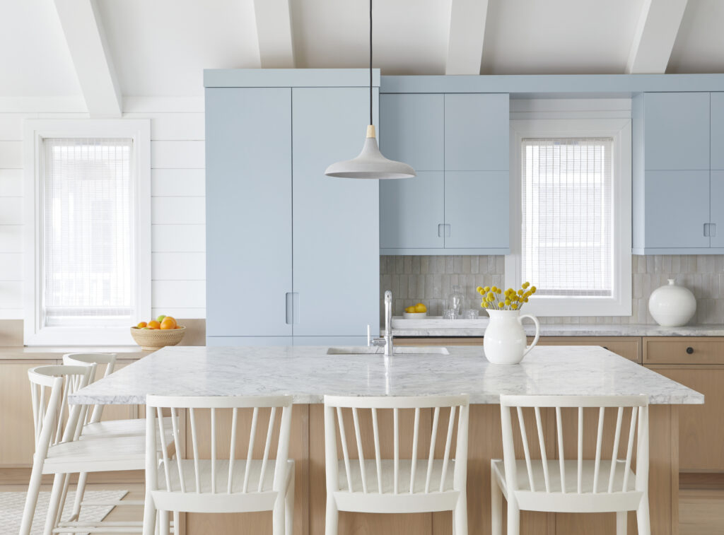
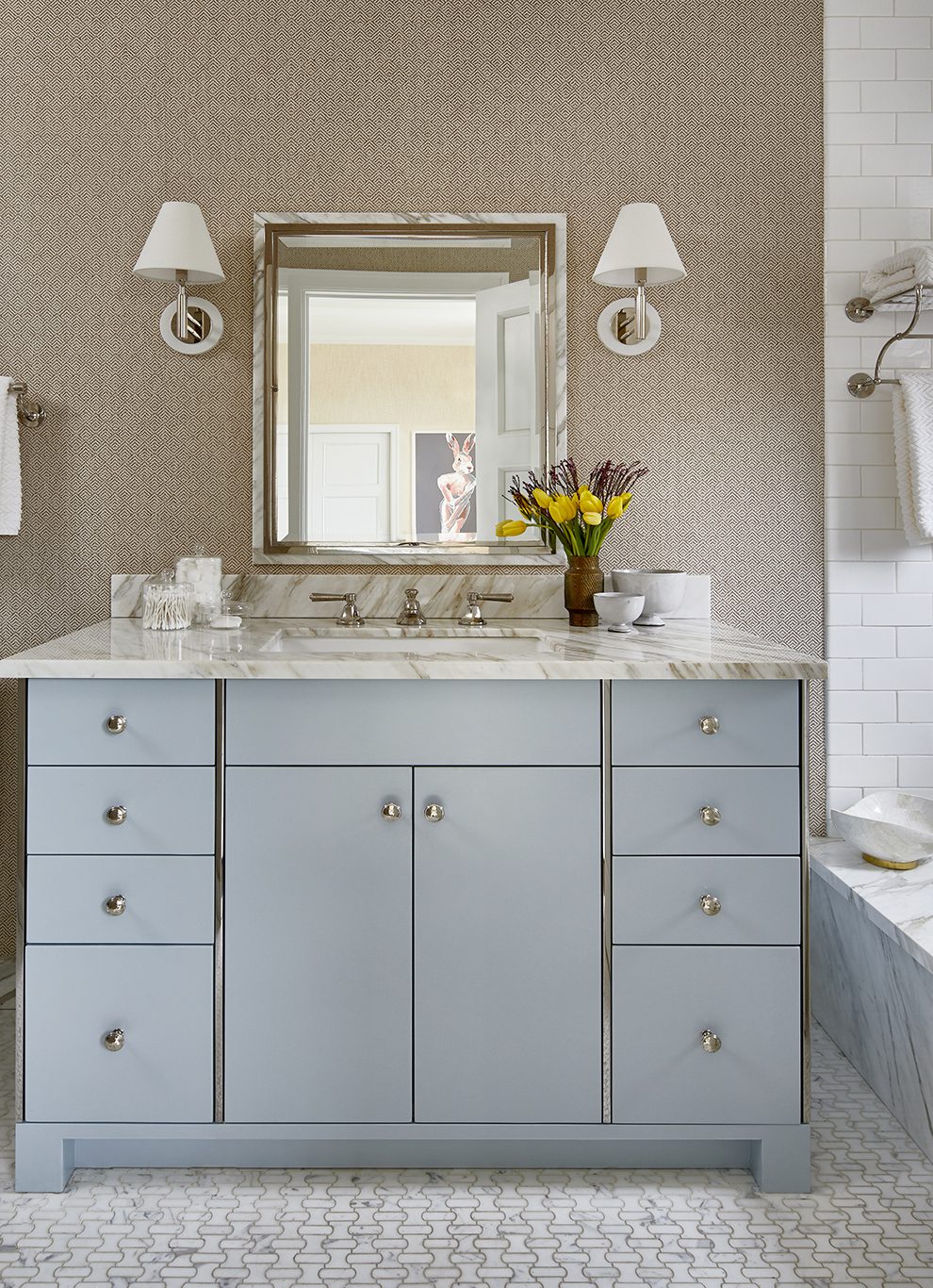
Farrow & Ball | Parma Gray
The Total Chameleon
Despite its name, Parma Gray is undeniably blue – but it lives in a nuanced, atmospheric space between sky and stone. It’s one of the most adaptable colors in our toolkit, with an uncanny ability to read the room and respond to what surrounds it.
Paired with crisp whites, Parma Gray reads clearly blue. Introduce darker tones or warmer woods, and it deepens, becoming more grounded and moody. This flexibility is exactly why we trust it.
We’ve used Parma Gray in everything from kitchens to bathroom vanities to living spaces. In a beachside kitchen, it delivered a coastal sensibility without tipping into anything kitschy – fresh and airy, yet still sophisticated. It’s a color that understands restraint.
If there’s such a thing as a “little black dress” of paint, this might be it.
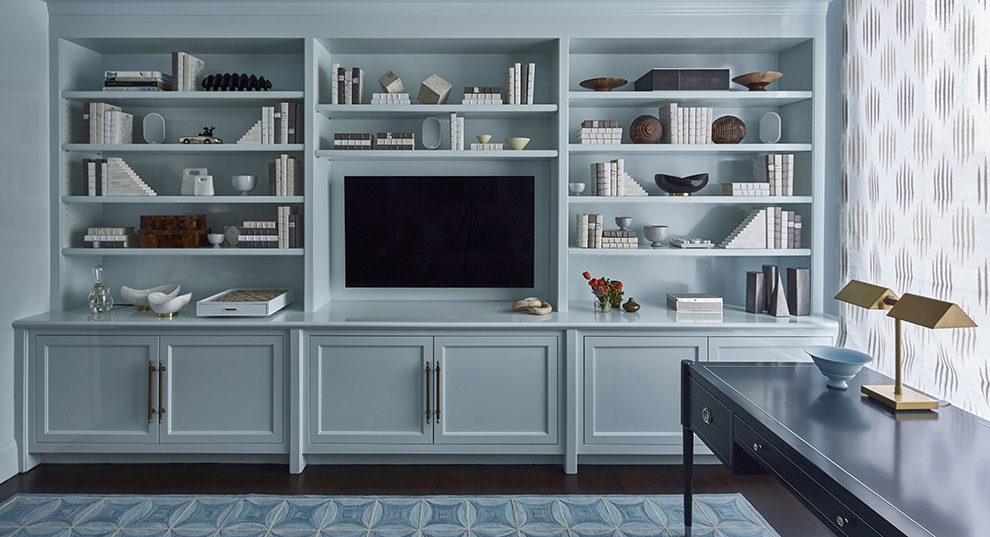
Benjamin Moore | Whispering Spring
The Enveloping Hue
Whispering Spring entered our rotation while designing a den intended to feel calm, quiet, and restorative. In this particular space, we initially tested Parma Gray but the light (Upper East Side of Manhattan) made it feel heavier than we wanted. Whispering Spring was the pivot that brought the room into balance.
This shade is soft, ethereal, and gently luminous. To amplify its effect, we employed a “wide brush” approach – using the same color on walls, trim, ceiling, and custom millwork.
When a room is drenched in a single hue, the architecture softens. Edges blur just enough. The space feels cohesive, intentional, and enveloping, like a deep exhale.
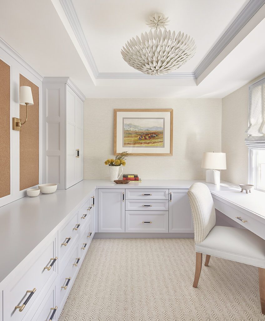
Benjamin Moore | Beacon Gray
The Clear Classic
Beacon Gray sits delicately between blue and gray, creating the kind of subtle ambiguity we love. It’s powdery, light, and refined – never overtly sweet, never overwhelming.
We often turn to this color in home offices or workspaces. Its clarity keeps a room feeling open and uncluttered, making it ideal for environments where focus matters.
Beacon Gray thrives on contrast. When paired with warm whites or soft creams, its blue undertones come alive, offering a gentle presence without dominating the space. It’s a pastel with polish.
The TG Method, in Practice
Blue requires patience. It demands context. And it rewards restraint. The shades we trust are the ones that hold their ground – across lighting conditions, architectural styles, and materials – while allowing a room to feel layered, livable, and resolved.

