


In our last post, we explored the lighter, airier side of blue. But once we start heading into the deeper end of the spectrum, we almost always get the same question:
“Isn’t that a lot of color?”
Our answer? Not if you do it right.
At Toledo Geller, we treat deep blues as neutrals. Think of them the way you think about a perfect pair of dark-wash jeans — they somehow go with everything. A great navy or saturated blue creates a rich, steady foundation that lets art, wood tones, and textiles really sing in a way beige or gray just… can’t.
Welcome back to The Method, where we’re breaking down the heavy hitters — the blue paint colors that anchor a room and quietly do the most work.
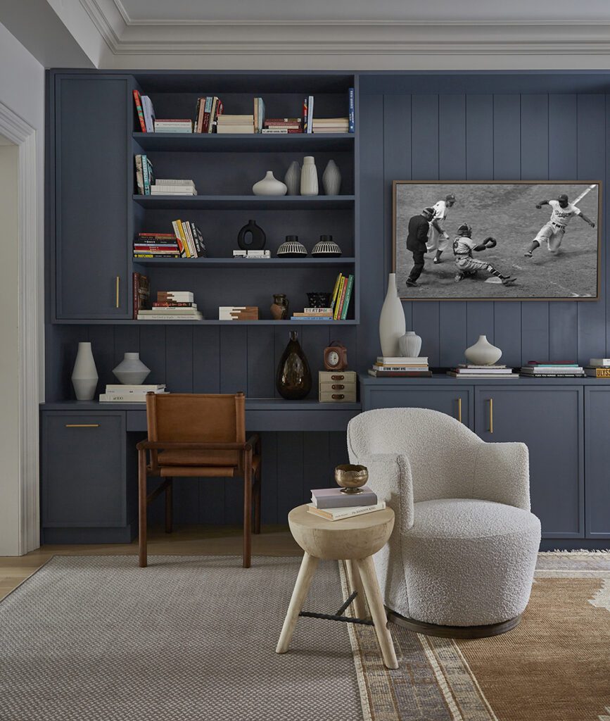
The Architectural Blue: Benjamin Moore Phillipsburg Blue (HC-159)
So nice, we used it twice.
Phillipsburg Blue is part of Benjamin Moore’s Historical Collection (always a smart place to start when you’re searching for a classic paint color). It has an incredible saturated depth that feels timeless rather than trendy.
The Built-In Power
We especially love Phillipsburg Blue on cabinetry and millwork. In this family room, we wrapped the floor-to-ceiling built-ins in this deep blue, and the room immediately gained soul. It’s dark enough to feel moody but still reads unmistakably blue — never flat, never blacked-out in the shadows.
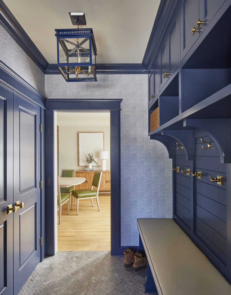
The Mudroom Workhorse
This is also one of our go-to mudroom paint colors. It hides the inevitable scuffs of real life while making a so-called “service space” feel just as intentional as the rest of the house.
The Method Secret:
That subtle gray undertone means Phillipsburg Blue plays nicely with almost any hardware — brass, bronze, or nickel all feel right.
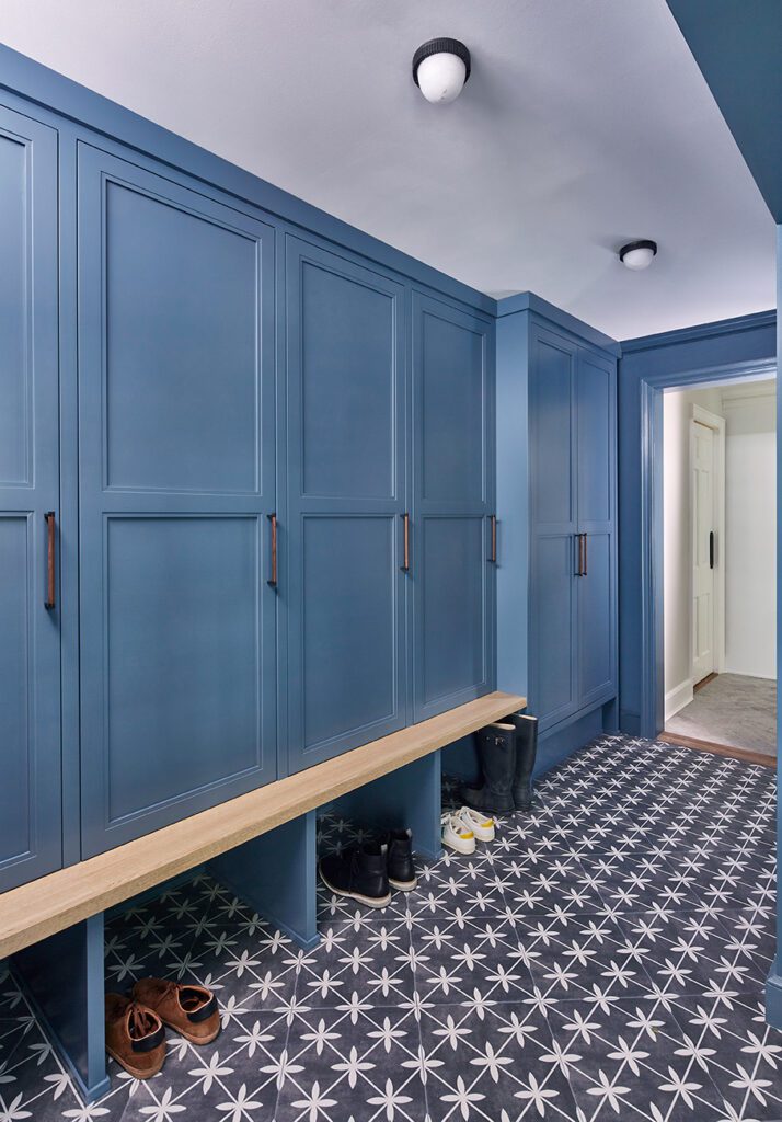
The Classic Navy: Benjamin Moore Newburyport Blue (HC-155)
If Phillipsburg feels a little dusty and historic, Newburyport Blue is a true, confident navy. Crisp. Polished. Forever.
The Mudroom Pivot
We used this navy blue paint in another mudroom project where we wanted more of a nautical-meets-traditional punch.
The Vibe
This is the Goldilocks of navy blues — not so dark that it disappears at night, and not so bright that it starts feeling primary.
Why It Works
In high-traffic spaces, a classic navy like this commands attention. It gives main-character energy, not supporting cast member.
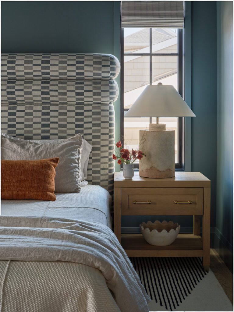
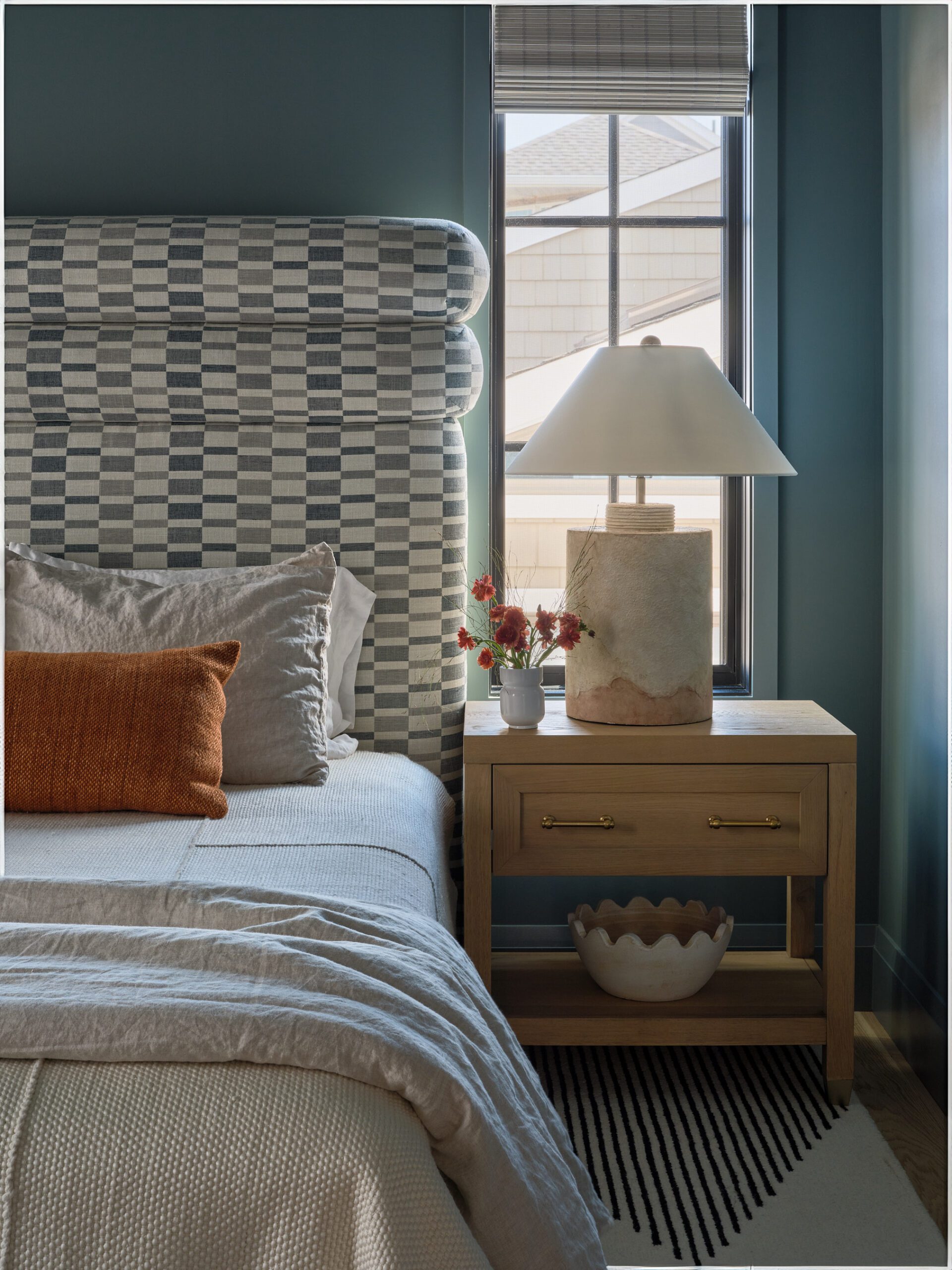
The Ultimate Sanctuary: Benjamin Moore Steep Cliff Gray (2122-20)
If we’ve learned anything in this industry, it’s this: a paint color with “gray” in the name is almost never gray.
For this guest bedroom, we wanted something that would fully envelop you. Steep Cliff Gray — a deep, blackened teal-blue — does exactly that.
Creature Comfort
We always say humans are den creatures. We crave cozy, enclosed spaces. A color this deep makes the walls recede and the bed feel like the safest, most inviting spot in the room.
It’s especially powerful in:
- Larger bedrooms
- Rooms with tall ceilings
- Spaces that need instant mood
The Method Secret
This is a commitment color. You have to lean all the way in. It’s for someone who wants their bedroom to feel like a high-end hotel suite — designed for the best sleep of your life.

