A glimpse into our process, styling tips & tricks, and new projects. Welcome to Toledo Geller!

UPDATE A TRADITIONAL CEILING WITH BOLD COLORS:

Thank you to Livingetc for featuring Virginia's personal home!

'My advice for modernizing a traditional ceiling is to use unexpected and bold color combinations. Here we used a cobalt blue on the beams and trim and the palest lavender within the coffers. in the room, we used a daring mix of furniture styles – the dining table was French country, the buffet 70’s retro and classic klismos chair in a bright white and canary yellow combination. The mixing of furniture from different time periods eliminates the time stamp on a traditional room,' adds Virginia.

TG Tip: Styling With Flowers:

When it comes to styling with flowers, think about what vibe you are trying to establish (happy, sultry, sophistication, drama, etc.) Next, look for colors that will work nicely with the colors and patterns you have in the room. Lastly, determine scale. Ask yourself...does this need to be really tall, small, wide, tightly bunched together, etc. to help determine the vessel size.

At Home Bar:

The hottest new lounge in New York City? No. Our client’s bar room in the suburbs of New Jersey? Yes. When their children became teens and tweens, our clients were ready to take their entertaining style up quite a few notches and transform what was once a playroom into the ultimate spot for hosting and entertaining. We took one color from floor to ceiling and even utilized it for the custom-built sectional to create the lounge vibe they wanted. Now, we dream in aubergine and would like to spend most of our free time here

Take a Look at What it Takes to Design a Showhouse:

Participating in a showhouse is an incredible way to get to design a space with very minimal design restraints. You can really let your creativity flow as long as the timelines are realistic. Jessica says, “Timelines are usually far too short across the board, but just how short becomes a big factor in whether we’ll do a showhouse or not". You really do have to call in favors from every vendor and tradesperson on your contact list in order to achieve the vision. So why do we do them? Well, the answer is simple! These showhouses allow us to stretch our creative imagination and pitch ideas that clients may not initially be on board with. You really can present your style and aesthetic to the world without limitations!

You can read all about the experience different designers have at showhouses here as well as the reasons why we just can't stay away!


Barn Turned Guest House:

Watch as Jessica and Virginia renovate and design a barn to turn it into a modern, country guest house in Greenwich, CT. They take you behind the scenes here. Trust me! You wont want to miss the showstopper: the buffalo plaid U-shaped sectional in the main living area. They also carry this pattern throughout the house as a motif, you'll see it pop up in the bedroom and bathroom as well. Jessica and Virginia used texture as an accent in the framing of the artwork, the baskets and wood accents to create depth within the color scheme. You can watch this video here.


The Kaleidoscope Project - The Impact & What’s Next:

What's next for the Kaleidoscope Project? Join Virginia at the Las Vegas Market on January 25th, 2022 where she along with 9 other Kaleidoscope Project designers will participate in a fast-paced discussion around this Designer Showcase venture which showcased their diverse talents within the interior design industry. Thir focus? The impact of the Kaleidoscope Project on the industry and what's next!

Learn more about this discussion about the growing Kaleidoscope Project here.


House Beautiful's 2021 Whole Home: Owner's Retreat:

Virginia and Jessica took on a large feat designing the intimate main bedroom and connected bath in House Beautiful's 2021 Whole Home. The space includes the owner's bedroom, the bedroom itself, the owner's bathroom, and the closet. In order to celebrate the Texan view of rolling hills and wandering wildlife outside Toledo Geller quickly "decided to take the idea of a modern farmhouse that honors the location and show that this style can be more than black and white." Read through this article to find out more about what went into designing this sunny, bright Owner's Retreat.

They used a mustard wallcovering made of linen and paper from Phillip Jeffries, then added in touches of tobacco browns which they incorporated in the drapery and ottoman fabric from The Vale London and Fabricut, milky creams, and pale pinks. The upholstered canopy bed and plaster chandelier from Circa Lighting were used to balance the whitewashed vaulted ceiling and contrasting beams which gave the room an expansive feel. A custom wool woven rug from Fibreworks, designed to fit around the fireplace, was topped with a plush merino rug from The Rug Company  perfect for stepping right out of bed. Oh! And don't forget about the mattress from Stearns & Foster. With this mattress the bed is just as comfortable and inviting as the room itself.

You can shop the Owner's Retreat Here.


This Luxurious Bedroom Was Inspired by the Lush Texas Landscape | HB:

Dive even deeper into House Beautiful's fourth annual Whole Home with Jessica and Virginia. They designed the gorgeous owner's suite in this annual built-from-the-ground-up showcase of the finest design ideas! You can watch them talk more about the process for designing the space in this video here. They chat about how they came up with the layout for the bedroom, the color scheme and their thought process for the design itself. They also talk about what it was like working with the builder on this project, Tyler O'Brian, owner of Agave Custom Homes. You wont want to miss as they dive even deeper into House Beautiful's Whole Home 2021.

Budget Friendly Custom Tile:

Boy do we have the best budget friendly tip for you! Toledo Geller, in an interview with House Beautiful talk about their favorite trick to budget friendly custom tile. You can get the look of gorgeous hand selected tiles for the price of premade tiles. How you may ask? Their trick: use premade tiles...cut into smaller sizes. Genius! And since tile can make or break the design of your bathroom this smart solution gives you more creative control and helps you save.

Generally, you can purchase ready made tile from stores like Home Depot, Lowes, or Floor & Decor that are in standard sizes and cut them into smaller pieces to create a custom tile pattern.

Read all about how they achieved a custom checkerboard-like pattern for the owner’s suite in House Beautiful’s  Whole Home this year HERE.


How Toledo Geller Decks the Halls:

It's the Holidays! Have you ever wondered how Toledo Geller decorates for the holiday season? In this article from The Scout Guide Bergen County both Virginia and Jessica describe how they use special holiday decorations to make their home lively and happy for the holiday season. While they are not the big tinsel and blingy holiday decorators, they do create beautiful, unexpected schemes that are true to the home's architecture and the designers' cultural roots. Plus Jessica shares a super cute holiday tradition that will surely put a smile on your face!

Virginia’s home dates back to the 1920’s so she embellishes her covered porch with lovely fresh garland and old school/retro big, warm-colored bulbs that reflect the period. Every year Virginia chooses a color scheme to coordinate her holiday decorations. This year, she is incorporating a pop of color into everything and ribbons will be added to her collection of glass and white ornaments. Click here to find out what color Virginia picked for the holidays this year! What a fun way to keep decorating for the holidays fresh and exciting by changing up the color schemes every year. Don't be afraid to go bold! The holidays only come around once a year.

Jessica is Jewish, so she did not grow up collecting Christmas heirlooms.  But Jessica’s husband is Christian and now that her twins and baby are growing up, she and her children have been building their own family traditions. One decorative item that is especially meaningful is the family tree adorned with custom hand-painted ceramics that she and the children paint at their local ceramics shop.  This tradition is now 4 years old and Jessica is enjoying watching the collection grow. What a special way to incorporate a fun family event into holiday decorating! How special is it to be able to look at a tree full of decorations that your family has made over the years?


Take a Tour of Virginia's Home:

Have you ever wondered what Virginia Toledo's house, from Toledo Geller,  looks like? Well you've come to the right place! Better Homes & Gardens  took a tour of her bright, beautiful home which you can find right here.

In the article Virginia talks about how she achieved the perfect balance of bright, happy colors and clean, simple rehabilitated furniture findings from consignment shops and flea markets. As you walk through her home you can't help but smile. From the gorgeous watercolor textile from James Dunlop Textiles, to all the colorful, textural wallpaper throughout the home from vendors like ThibautOsborne & Little, and Spoon Flower. Even the paint colors aren't boring, like the jaw dropping high gloss yellow ceiling in her foyer from Benjamin Moore. Virginia says, "I find so much joy in over-scaled pattern and a mash-up of super-saturated hues with natural and rough-hewn textures". And you wont miss out on any of that in her home!

Virginia's inspiration for the home came from wanting "a happy summer feeling - the kind she associates with sitting on a porch in South Carolina". Equally as important is her heritage. You can read all about how spending summers in Puerto Rico, as a kid, with her family changed her perspective on design here!

You can shop all of Virginia's furniture and textile items here, just scroll down to "End of the Rainbow".

Choosing and Hanging Curtains:

Follow Virginias tips and tricks for hanging curtains and you'll be a pro in no time! Trust me she knows what she's talking about! In this article with Insider Virginia delves into the ins and outs of finding and hanging the perfect curtains. She even gives us a tip about the difference between curtains and drapes. . Though both are pairs of fabric panels hung from a rod, drapes are always lined, while curtains are not.

The number 1 question Virginia always asks herself is: are the curtains the "hero" of the room or are they "merely another character in the play". This helps to determine which direction you want to go in terms of fabric patters, color, and the way they hang.

Virginia also answers questions like: "How to choose the right size curtains for your windows?", "How high your rod should be from the window?" "How to properly hang your curtains?"

You can find all of that juicy information here, in this Insider article.

Toledo Geller Does Custom Furniture:

Have you ever wondered how Virginia and Jessica met? Trust me you wont expect their answer! Click here to find out. In an article with Buildlane - a company who specializes in making custom furniture the duo talks not only about how they met but also answer an array of questions about their process in creating their beautiful and unique custom pieces for clients.

They chat all about the first custom piece they ever designed, which was a set of sleek ‘fireside’ chairs and a modern, low-slung tete-a-tete, mistakes made in making custom furniture, their favorite custom piece, and so much more. Take a look at this article with Buildlane to read all about it!

Lacquer - The Queen of Gloss:

Take a look at this Financial Times article which talks all about LACQUER! Lacquer is none other than a lustrous finish for wood that has been used decoratively in East Asia for about 2,000 years. This finish bounces light around the room keeping your eyes moving from one surface to the next. When used in the correct way you can achieve breathtaking dimension and luxury.

Financial Times took to exploring this idea of glossy lacquer which is a fan favorite among designers in creating layers. You can find Toledo Geller's use of lacquer on the beams of the ceiling in this dining room. Its rich deep color and glistening glow make it a statement you can't take your eyes off of.

Find some fun tips on how to use lacquer and explore how Toledo Geller and other professional interior designers use it in their designs here, in this Financial Times article.


Dramatic Drapery at the Kaleidoscope Project:

Take a closer look at Virginia's Comparte Room at the Kaleidoscope Project! Where 23 designers of color redesigned the Cornell Inn for an incredible cause! Here she talks more about her process for deciding upon those gorgeous, cascading midnight blue draperies as well as the refreshing global patterned valances and much more!

In this interview with The Shade Store, where all of the gorgeous window treatments are from, Virginia recalls "walking into the space for the first time and immediately began sketching my ideas for how I would use drapery to make a really big statement in the room." She wanted to celebrate the area she was designing and "give it some distinction from the rest of the room". The room definitely feels celebrated! Especially when using one of Nate Berkus fabrics as one of our drapery layers. All the rich colors, playful patterns, and deep textures work together to create a space that feels lively and happy. Who wants to come book a stay at the Cornell Inn with us?

A Closer Look at Virginia's Comparte Room at the Kaleidoscope Project:

Dive deeper into Virginia's design process for the Kaleidoscope Project! In an interview with The Scout Guide Virginia talks about where she pulled her inspirations from, challenges that arose with the architecture, as well as what her favorite feature in the room is. You can read all about it here.

Virginia describes her design philosophy as "controlled chaos" and that did not waver for the Kaleidoscope Project! The medley of reds, whites, and blues creates a warm space that would encourage guests to gather and linger. She named the room Comparte, which means “to share” in Spanish, and installed a communal table from Dunes & Duchess where guests could dine together and share experiences. The textural rattan bistro chairs surrounding the gathering table from Kenian Home welcome any visitor with open arms. The intricately patterned wallpaper by Schumacher paired with the dramatic draperies from The Shade Store make a big statement in the room. And that statement... "WOW"!


The Kaleidoscope Project:

Virginia was honored to have been chosen to participate in The Kaleidoscope Project which as she says, is a diversity in design that is long overdue.  This project brought 23 leading designers of color together to reimagine and redesign the 18th century Cornell Inn in Lenox, Massachusetts. This legendary Inn became a Showhouse open to the public for viewing. All ticket proceeds went toward creating scholarships for young designers of color interested in pursuing an art or design career. With sponsors like Kravet whose fabric you will find on Virginia's banquettes, The Shade StoreNate Berkus who gave us a sweet shoutout for using his fabrics on our drapes,  Ellen DécorCirca Lighting where we pulled all of our light fixtures from, and others, as well as the incredible talent the designers brought, this first-ever designer Showhouse celebrating diversity was an incredible success in creating a platform for designers of color to do what they do best - DESIGN!

Take a look at some of the rooms from the Kaleidoscope Project here. Trust me you won't want to miss Virginia's jaw-dropping dining room. The gorgeous red, white, and blue tones that Virginia had chosen "felt native to the inn and its New England location, but the color palette is used in a globally inspired pattern.” Toledo felt it was exactly what the Kaleidoscope Project represents, the diverse backgrounds “that make up the fabric of America." she told Elle Decor.

Designer Jessica Geller tweaks tradition with an “explosion of color and pattern and a dose of mayhem”:

Another great write up of Jessica's home in Design NJ. Click through to read the full story!

Jessica had lots of plans for the 1920s center-hall colonial-style home her family purchased in Essex Fells, New Jersey, in March 2017. Within just a few years, the designer and mother of three made her mark on every room in the four-bedroom, 3½ bath home. “My personal style is one of absolute comfort,” Geller says. “That was the vibe I wanted to create — the kind of place people feel so comfortable that they don’t want to leave.”

Each room has its own personality and its own bold moment, with varied intensity. Spaces that are used more frequently, such as the kitchen and family room, may be a bit more subdued; other pass-through spaces are a bit more bold. The style veers toward eclectic, “but in a refined, not-haphazard way,” Geller explains. “Some might call it “happy chic.”

In what Jessica describes as a “pandemic-inspired move,” the family sold their home and temporarily moved to Florida. They have since returned to New Jersey — to the same Essex Fells neighborhood, in fact — where they purchased a sprawling Dutch Colonial, just down the street from their previous home. Geller assures us: “There will be lots of pattern, color and unexpected moments!”

Toledo Geller Turn a Drab Spare Room into a Dreamy Moroccan Inspired Bathroom:

Dive deep into how Jessica and Virginia turned a cramped bathroom into a show stopper by adding a bit of square footage from an adjoining underused spare bedroom. Inspiration for this space came after asking the client "Where are you dying to travel to next?" With an answer like Morocco, how could you not use it as an underlying thread for the entire renovation! Take a look at this before and after.

In an interview with House Beautiful Jessica and Virginia talk about how they framed out dramatic arches into the space to create designated zones for different needs, making the room hyper-functional. This arch idea was born out of a need to make the bathtub be the focal point as per the client's request. So the team said, "okay, well let's really make it a focal point".  Enter the graceful arch idea, which they echoed in the shower doorway as well.

Of course, Moroccan architecture often features dazzling displays of mosaic tile, so what better reference than a mix of tiles in the bathroom? Geller and Toledo married zellige, marble, and patterned tiles to add visual interest to the room without going overboard with colors. The hunt for the perfect blend of materials had the design team sourcing from Mosaic House and Complete Tile Collection to name a few. This bathroom couldn't use just any vanity and so our custom millworker was brought in to build the bleached wood, custom paneled design we had dreamt up.

Read more about the ideas that birthed this incredible bathroom here.


A Posh Pied-à-Terre Renovation Pairs the Elegant with the Unexpected:

Unexpected pairings are kind of our specialty! In an interview with Aspire Design and Home Magazine  we get to delve into a renovation in the heart of Manhatten where Jessica and Virginia were able to put their inimitable spin on a Pied-à-Terre . Home to a prominent entrepreneur, this apartment in a landmarked Park Avenue building is filled with unique bespoke details and inspirational city views. Consider the drink ledge built into a custom server in the living and dining room, where a brand new wall of floor-to-ceiling folding glass doors frames iconic skyline panoramas. Another dramatic aspect of this space is a Toledo Geller  distinctive 360-degree gas fireplace for inside or outside use, that they custom designed with their favorite gasless fireplace company, Hearth Cabinet.

What is one of the best features you may ask? When asked what one of the best features of the newly renovated home was of course we had to say that  “the biggest standout features in this home are the double-sided fireplace and the wall-to-wall glass doors that open entirely to merge the indoor and outdoor living spaces, blurring the lines between the interior and exterior”. Spanning the entire apartment, the terrace’s ledge is ideal for perching small bites or cocktails, and a Zen-like meditation area features a water fountain and mahogany daybed. And because our client is a risk taker, the art couldn't be subdued. After touring various galleries with our clients we found perfect pieces at Lilac Gallery in NYC and the provocative art shown above by Mike Dargas through Art Angels.

Don't forget to click here to read about what went into designing this beautiful space.

At the end of the day, this opulent apartment offers a calm respite from the stress of city living, Jessica observes. “When we work with clients on pieds-à-terre, we’ve learned that they usually want an experience of simplistic luxury. The space isn’t overly personalized and feels like a luxury hotel where you can pop in at a moment’s notice.”


Wallpaper for a Punchy Powder Room:

The powder room is one of the perfect places to go bold or go home. Nothing is more show-stopping than a space that makes your draw drop! What better way to achieve that effect than with some statement-making wallpaper. In an article by Luxe Interiors & Design where top industry pros share the prints and patterns that can stand alone—and boldly stand out—within a home’s greater design scheme, Virginia shares this beautiful wallpaper by Rebecca Atwood.

“This paper comes in a variety of colors and its vibe changes drastically depending on the colorway. In a powder room, it can be the star of the show but can also really enliven a space that may already have walls tiled halfway up with very basic tile—which happens often. Our rule is, have fun with it!”


A Space-Saving Idea For Small Bedrooms:

Small Bedroom. The dreadful words that puzzle most homeowners. The last thing we want at the end of a long day is to come into a room that feels cramped and suffocating. So, how do you make a small bedroom feel spacious and comfortable without sacrificing design? Well, look no further. Here is our favorite trick to maximizing space in any bedroom!

We shared this clever design trick with House Beautiful to turn your cramped bedroom into an oasis. And the best part is it works in any room that you want to double as a guest room! Scroll down to tip #25 to find out more! Now friends and family have a comfortable space to stay the night AND you have a beautiful space to look at.

Some of our key design elements in this room are our custom designed bed with a fave Osborne and Little fabric, the diagonal stripe fabric by Tulu Fabrics found on the drapery and of course, the room maker...the rainbow drip wallpaper by Rebel Walls.


An Instagram Post Ignites a Chain of Giving Back:

"We are all in the same storm but we're not all in the same boat." The phrase that sparked a wave of giving back. With projects temporarily on hold while we waited in our homes for Covid to be over. The Toledo Geller team decided to keep their creative juices flowing by posting a call for first responders deserving of a home makeover. Read all about how this came to fruition as well as take a look at some of the before and afters here on House Beautiful. What better act of service for an interior designer to do when so many are struggling to get through Covid than to help those that were on the front lines come home to a beautiful oasis!

Within days the duo was flooded not only with suggestions for deserving recipients but with other design teams and home retailers who wanted to help in some way. With 3 first responders chosen Toledo GellerDecorated Interiors, and JBT Designs got to work on designing each person's chosen space. Take a look at the before and afters and the story

Junior Designer Janine took the lead on this project and with the help of donations from  Ballard Designs and Stark Carpet each recipient was able to come home to a space designed just for them. Take a look at this video from Toledo Geller talking a bit more about the project.


And, with many of their design projects put on hold as shutdowns and travel bans were enacted, the duo found themselves with some extra time on their hands. So, they decided to put their talents to good use. "We were seeing all these first responders, and we wanted to do something to help," says Toledo. "And we thought, well, the only thing we're really good at is design. So how can we use that to give back?"

Martha Stewart asks us for exterior paint color tips!:

An exterior paint color does more than up the curb appeal of your house—it also gives guests their first impression of your home. A good exterior paint color is like a little peekaboo of what's to come inside of the home. It sets the stage for what to expect. That's why it's important to pick a shade that speaks to your distinct style and enhances the unique architectural features of your home.

Martha Stewart asked us to share a favorite exterior paint color combo and we happily obliged. Jessica shared that if you're looking for a chic way to set your home apart from your neighbors,  you can play up a neutral exterior by painting the trims in a muted shade of blue, as she did in her own home. "While you might not necessarily want to match the houses next door, you also don't want to clash with them," she says. "A cool white with gray undertones, like Moonshine #2140-60 by Benjamin Moore, reads as pure white in direct sunlight, while a soft blue hue, like Under the Big Top #1675 (also by Benjamin Moore), brightens up accents without looking too electric."

The biggest tip we can give for choosing your exterior paint color is sample, sample, sample. If you've done any research on choosing a paint color for inside the home, you know that the type of light in each room has a huge impact on the shade. Well, consider all of the natural light the outside of your home experiences. Jessica sampled at least 6 blue colors for her front door and shutters, which all looked like they would be perfect with the white stucco on her home. But when she sampled them outside some read too bright, some too dull, some too green, and so on...She ended up going through the leftover paint from her interior rooms and on a whim, sampled the blue color that is in one of her daughter's bedrooms. And, that one finally worked!

Kids' Bedrooms and Where to Start:

This child's bedroom has gotten a lot of attention on instagram for it's bold pattern and color, and we were thrilled to weigh in on how to make it work when Domino asked.

Here's the scoop, directly from the article.

When Jessica Geller, principal at Toledo Geller, was designing her daughter’s attic bedroom, she knew she needed a nondirectional wallpaper (meaning it looks the same no matter which way you install it) that could run up the sloped walls and along the ceiling. “One of my biggest design pet peeves is when a room with angles has an abrupt stop with a transition to paint,” she says. She found just the right print in Pierre Frey’s Arty (now discontinued). “It has an organized chaos to it, and the painterly feel captures the personality of the little girl who lives here,” Geller notes.

She knew she would need to mix in worn woods and neutrals to tone down the vibrant pattern, so she grounded it with a neutral-colored rug that has burnt umber undertones (pulled from the wallpaper) and added a hint of pink—at the demand of her daughter—with a bed upholstered in a fuchsia ticking stripe. She already owned the blue nightstand, which she inherited from her parents. “The color is not a perfect match, but because the painted brushstrokes fade from opaque to washed out, there is a range in coloration, which allows a variety of blues to work,” explains Geller.

A Happy New Jersey Home:

We are so happy to share that Virginia's happy home is featured on One Kings Lane today! With the onset of the COVID-19 Pandemic, it immediately became clear to us and our current and former clients how important it is to have a home that you love being in, and a colorful, cheerful home helps that much more. While this feature was scheduled long before we knew we would be isolating at home, the timing of the article couldn't be any more perfect.

We've noted in past interviews that we think 2020 is going to trend toward color and happy design, and now we're even more convinced that we can all use a dose of bright and cheery in our homes. In explaining the color theory in her home, “everything’s like this ping-pong situation,” Virginia says, referring to the bouncing between colors and patterns that, almost counterintuitively, creates a beautiful harmony.

Virginia's passion project, the hunt for the perfect piece in thrifting, antiquing and consignment shopping for furnishings, is also something that we think will have a major upswing in 2020 and beyond because it's readily available and we won't need to rely on overseas shipping or factory slow-downs or shut-downs. Plus, shopping locally and supporting our small business is now more important than ever.

You can check out Virginia's house tour with OKL here, and if you'd like to read a previous article written about her home, check out this piece in NJ Monthly.

Quick and Easy Decor Changes Using What You Already Have:

Everyone is stuck at home, many with nothing to do but stare at our spaces and dream of new decor. While you might not be able to go out and shop for new furniture right now, what we can do (easily, and for free!) is switch around artwork and mirrors that you already own to create a fresh new vibe, and at least change up your scenery a little bit. We shared this instant design tip with The Wall Street Journal and tested it out on a photo shoot where we swapped the art that usually hangs over the dining room buffet with the round mirror that's been over the sofa (check out our previous post to see the mirror hanging in this same space). Two new looks for the price of...none!

Tips for choosing paint colors for kids' rooms:

You might have realized already that we love designing kids' bedrooms! Color in kids rooms is a MUST in our opinion. Kids thrive in colorful spaces and one thing we know for sure is that color has a huge impact on mood, feelings and emotions – things that can be all over the place when kids’ brains and bodies are growing at rapid rates. But it’s also important to make sure there is some sense of flow in the home, so the color should not be out of left field. When painting kids bedrooms we opt to let the furnishings pop in order to keep the walls more consistent with the rest of the home. This means whites or neutrals, and when we do use color on the walls, it’s a tint of the color, as opposed to being super chromatic. A shade of pale blue, a washed out pink or purple - colors that are barely there.  Then we might play up the ceiling or base and case with a true color. And of course, window treatments, bed upholstery and art are great ways to introduce more color into the space.

Martha Stewart included our tips in her article "How to Choose a Youthful Paint Color for Your Child's Room That Still Complements the Rest of Your Home" so if you're trying to give your child the freedom of personalizing his or her space but also want your home to feel cohesive and not like a color-funhouse-whodunnit, click through to read the article for more home decor tips.

Jessica Geller's New Jersey Home Is a Funhouse of Pattern and Color:

We've been keeping this design project under wraps for awhile and we are so excited to finally be able to share it with you. It seems to be the perfect fit for Spring - bright, airy and fresh - and a lot of happy! People always ask how we are able to mix color and pattern so fearlessly, and while it's bold and interesting to look at, it's not overwhelming and still has its moments of quiet and peaceful design. We are truly thrilled that House Beautiful is the magazine that published it - from the time that Jessica first decided to pursue her passion in Interior Design, HB was THE magazine that she dreamed of being featured in.

Part of the pattern mix is an art, and a dash of happy accidents, that everything works together. But most of it is being very strategic in what types of patterns are used, where they are placed, and what they are layered with. For instance, look closely and you will see stripes in every. single. room. in this house. It's almost like a non-pattern pattern and the use of geometrics allows a mix of softer florals and marbleized wallpapers and upholstery to mix from one space to the next.

Check out the article to hear more about this redecorating project where Jessica and Virginia set out to create a home that would speak to Jessica's "unique, colorful style (which she describes as "fun, colorful, happy, a little bit quirky, a little eclectic, super casual, and relaxed") and serve as a comfortable home for her husband, kids, and the large extended family that's often visiting." You'll also read more about why the kitchen is white in this self described maximalist's home, the re-thinking of the traditional layout in which living room turned into an oversized-dining room, and why the master bedroom is more subdued than the rest of the home.

From House to Home: a New Jersey Residence is Transformed by Toledo Geller:

The inspiration for the design of this home came directly from our clients - on our Interiors Style Assessment they told us that they wanted a modern, cozy, and fun home that was bright and airy — specifically, “Southern California Newport Beach meets Hamptons meets sleek NYC" -- all while in the context of Northern Suburban New Jersey, mind you!

Up for the challenge, we were - you know we love making lemonade and there was a lot to be made here...from partitions in strange locations to bulky soffits and headers and a dated wood floor...we had our work cut out for us.

Still, something was feeling off with the flow, and we were able to convince our clients to flip the orientation of the living space, relocating the dining room and making it less formal, and adding a bar that would encourage the family to entertain more frequently. The space is quite long and narrow, which made it hard to find the perfect layout. We created a two-zone seating plan, merged by a custom-designed daybed, and relocated the dining room to be fireside.

One of the biggest challenges in a design project is that, although we as designers are looking at ta space with fresh eyes, when a homeowner has been living in a space for nearly a decade, any change can be a massive deal. It’s a huge adjustment to make a switch that is that impactful to the way they have been living. We can’t do our job well if the architecture doesn’t support the function of a room, which is why we start every project with an eye toward problem-solving.

Take a tour of the home here, and thanks to Rue for featuring this project!

The Rules That Made Me a Better Interior Designer:

Every designer loves the phrase "rules are meant to be broken" - but are they always? We can definitely get behind breaking design rules from time to time, but sometimes rules are meant to be followed, too.

Some simple, favorite rules that we shared with Pure Wow are:

MORE REALLY IS MORE

Unless you are going for a purely minimal aesthetic, ‘more is more’ is the design mantra to live by, or else it feels like you forgot to finish. The more layered the finishes and furnishings, the more done a room looks. For example, in this kitchen we paired a trio of pendants with dramatic surface-mounted fixtures. We knew that the kitchen finishes were so bold that a simple ceiling would be basic and boring.

DESIGN FOR HOW YOU REALLY LIVE

It’s easy to get swept up in pretty fabrics and eye-catching accessories, but it’s important to start the design process by truly considering how you intend to use a space. At Toledo Geller, clients begin by filling out an in-depth questionnaire. Instead of ignoring the function of a space and putting on blinders to how clients want to live we unearth a way to make their lives easier and their homes more beautiful.

THE CLIENT IS USUALLY, BUT NOT ALWAYS, RIGHT

Top-notch professional designers are always hoping to make their clients’ lives better and easier. One thing we have learned is not to listen to someone who tells us ‘But I don’t need a chair’ or console or lamp or whatever the item in question might be. As design professionals, we’ve been hired to make their space both functional and beautiful—and sometimes that means adding a few layers or pieces of furniture that they might deem unnecessary.

Interior Design Trends for 2020:

It's that time again...time to forecast what is in and what is out in the world of interiors, and you know we have a thought or two on that... We can't be the only ones sick of living in a beige and greige world, and we predict a year of happy, bright and cheerful color headed our way.

Here's how we laid it down for My Domaine when they asked for our predictions:

“Color. And we don’t mean a splash here and there, but true, genuine happy color. Think: soft rainbow. Unicorns and tie die have been all over the place and I think that trend will start to make its way into home design, not in a literal way, but in a very easy, suggestive way.” 

Let's meet back here in '21 to see if we were right?

New Year's Good Habits (we're not going to call them resolutions!):

With the turn of the year, and this time around, the turn of the decade, it's easy to get stuck making resolutions that aren't realistic to keep up with. That's why we were thrilled when Lonny asked us to share an easy home decor tip to bring into 2020 with us. A little home organization goes a long way.

Jessica shares"This year, I bought myself a label maker and have been corralling like-minded objects for weeks. I made it hyper-specific so that it’s impossible for the other household members to be confused about clean up. I even made a grab-and-go bin for quick activities to entertain in long car rides and at restaurants."

How's it going so far? It's not perfect, but it's making it easier for a big clean up and re-organizing every few weeks. As they say, 21 days to make a habit, right?

Toledo Geller featured in the New Crystorama Catalog:

We all have our favorites, right? One of our all time favorite light fixtures is the Broche from Crystorama. We've used it as a flush mount, a semi flush mount, a hanging pendant and a chandelier...and in both the white finish and the antique gold. Virginia and Jessica even have a version of this light in their own homes. Clearly, we love it. So, when Crystorama asked us to be a part of their new 2020 catalog and be featured beside this fixture we were thrilled. Why do we love it so, you ask? It's so versatile - depending on the application it can skew modern or traditional, and of course somewhere in between (that buzz word: transitional). Take a look at the new catalog for some timeless light fixtures at a great price, and be sure to enter Toledo Geller in the search bar to see our design take on this fabulous fixture! And, it doesn't hurt that we're featured alongside some of our design heroes and colleagues: Carson Kressley, Brian Patrick Flynn, Libby Langdon and Justin Shaulis to new a few!

Pantone Announces Color of the Year, and we are asked to weigh in!:

Clearly, we are lovers of blue (just take a peek at our portfolio and you'll see tons of the hue!), so we were thrilled to answer a bunch of questions from Aspire Design and Home about Pantone's announcement of "Classic Blue" as the color of 2020. Classic blue is so...classic, that many were surprised by it being selected as the color of the year. Coral, Ultra Violet and Greenery were the most recent colors of the year, and they are so bright and skew towards trendy. We welcomed the addition of the tried and true shade to the roster with open arms. Below is an excerpt from the article, but click through to read more of our thoughts on Classic Blue (as usual, we have many thoughts!).

It’s been mentioned that other Color of the Year picks have typically been bright and trendy, does the selection of such a familiar color surprise you?

“In times of political unrest and uncertainty we always see a move back toward something comfortable and familiar, so it’s not surprising to us that in an election year the color of the year is Classic Blue. It’s safe and secure. In general we see a swing back to basics – back to the things that we’re familiar and comfortable with. Transitional was “it” for so long and we see people moving toward a more modern version of traditional.”

Press: Wall Street Journal Off Duty presents Happy-Medium Decor:

Ok, this bit of press made us jump out of our seats. Not only were we interviewed for the cover story of the Wall Street Journal's Off Duty section, but it was a story that we just love - the rise of a new design style, called 'The Happy-Medium." All too often people ask us what our design philosophy is, and we really truly hate to label ourselves. There's traditional, modern and that all-too popular word 'transitional' (but what does that really mean, anyway?), and minimalism and maximalism. We've toyed around with the words "modern-ish" and "soft modern" but neither of those feel appropriate to our work either. Well, finally, a new design buzz word called "Happy-Medium Decor" and to be quite honest, we love it. It's a perfect description of our look: where patterns and color are introduced in measured but not chaotic ways. Traditional curves and materials are tempered by current forms and textures. It's that sweet spot that Goldilocks lived in and it's just right.

And, again, we were quoted alongside design greats like Sister Parish and Gideon Mendelson and talented designer friends Young Huh and Madcap Cottage. But the icing on the cake? The larger than life image was of our own Virginia Toledo's foyer which portrays the look to a T. #swoon

Check out the article and let us know what you think of the new design "it" word.

PRESS: Business of Home:

How involved should children be in the design of their own spaces? We LOVED being asked this design question from Business Of Home's editors! We like to think that our process allows us to have found the sweet spot: we keep the kids in the know and truly listen to their likes, dislikes and opinions, but we also communicate with mom and dad to make sure our selections meet their approval, too. This gives our children, tweens and teens enough control to allow them to feel like their bedroom is a true representation of themselves, but really keeps the reigns in the parent's hands so that there is room to grow, especially given the financial investment and kids' potentially changing tastes. When we first started our interior design firm, it seemed like everyone was calling us to decorate their children's bedrooms, even before designing the rest of the home, so we really got our design feet wet with kid's room design and became known for our knack at it. Click here for some of our kids' bedrooms, and read the rest of the article here.

“We always make sure to have, at a minimum, some touch-base with our younger clients, especially tweens and teens who have opinions with a capital O. We are currently working on a bedroom for a 12-year-old girl who has a very particular shade of blue in mind, so we are checking in with her more regularly than with our adult clients during our design process, sharing color palettes and patterns via email instead of waiting until our in-person presentation with her. We let them take a strong standpoint in terms of design, but we guide the kids and their parents on the design's staying power and longevity.”

Sotheby's Home Designer Profile:

If you want to hear about our favorite personal objects in our own homes, our biggest design secret and what we think is the most common design mistake, look no further. Sotheby's Home interviewed us and asked us these hot topic questions, plus a few more, and they also asked us to scour their site for our favorite finds that are currently available.

If you aren't familiar with Sotheby's Home, the art auction house now works with home owners, designers, and designer showrooms to sell previously loved furnishings and showroom samples at a steep discount. They also have frequent sales, and who doesn't love a steal?! It's one of our favorite tricks for design projects that have a tight deadline and we don't have the luxury of time to wait for long lead times. But shhh. You didn't hear it from us.

PRESS: HOUSE BEAUTIFUL:

This Suburban New Jersey Home Feels Like an Alpine Chalet

Teaneck, New Jersey, a suburban town just outside New York City, is not exactly the place you'd expect to find an alpine-style chalet. But in one lucky family's home, light wood ceilings and wool upholstery conjures images of bright mountainscapes, despite the locale. That's thanks to Next Wave design firm Toledo Geller, who transformed a dreary, downtrodden house into a welcoming family abode that feels at once cozy and bright.

When the design duo—comprised of Virginia Toledo and Jessica Geller—first entered the home, it was far from either of those adjectives. "It was very brown, muddy, 80s renovation," Virginia recalls. "You know, just shiny floor tile, wall to wall carpeting in rooms that shouldn't have it..." That is to say, ripe for renovation.

So, she and Jessica began to think about how to better use the home's spaces, especially the public ones: a sun room, living room, and central dining room.

They began with the living room, whose placement gave it very little natural light. "So they have the sunroom, which was where they thought they would spend most of their time, and then they had another room on the first floor that they were going to be using as their TV watching room," says Jessica. "So we thought, how are we going to get them into this room? We have to make it feel special, we have to make it feel different."

The two came up with the idea of covering the walls in a natural shiplap, to serve as a textural element that made the room feel special while also connecting it to the other parts...

TO HEAR MORE ABOUT THIS PROJECT, FOLLOW THIS LINK

Dear Designer:


I have a first-world problem – too many rooms! I realize that this sounds like a ridiculous issue, but my home literally has a family room, a formal living room, a sitting room and a library, and three of the four just sit there unused because my family only congregates in front of the television. Do you have any ideas of how to get us out of this one room and into the others?


Sincerely,

Fenced In


______________________________________________________


Dear Fenced In,


One of the first things we do when working on a home with multiple living spaces is to define the mood or activity so that each room has a purpose. Our goal is to create an ambiance that will draw you into a room. That means giving each room something special and different from the other rooms that might feel more inviting on any given day (i.e., is it cold and gloomy and that’s got you feeling gloomy, too, or is it a fling-open-the-windows-and-bask-in-the-warm-breeze kind of day? A catnap in the sunlight or a game of Clue?) Activities are also one of the biggest reasons that people will be drawn into a room. You are already using your Family Room for TV-watching so consider what other activities you’d like to engage with your family in – fireside stories, a cozy spot for reading or working on a laptop, puzzles and board games, etc.


The photo seen here is from a home in which each room has a distinctly different feel to it. We embraced natural light in the sunroom and kept everything as bright, airy and cheerful as possible. The formal living room does not have as much natural light, so here we developed a lodge-like feel, and clad the walls in a textured wood shiplap, used darker tones, and highlighted the fireplace by way of the seating arrangement. The den is the only room in this home with a TV and we emphasized the coziness of the room with a plaid wallpaper on the ceiling and selected a super duper deep sofa – one that allows you to fully recline and the whole family can snuggle together, or one or two people can even doze off on it.


Try to study the architecture of each room in your home independently and see what feelings it conjures up with you. Then, embrace the mood and decorate with that same train of thought.


Your decorating gurus,

Jessica and Virginia

Mantoloking, NJ Project Reveal:


We’re excited to kick off our summer of project reveals with this beautiful Mantoloking, NJ beach house. Located in Ocean County, this million-dollar listing is right on the beach with several ocean views throughout the house. This project came about after we had reached out to a Facebook Hoboken Moms group because we were looking to design a summer home. Our reason for wanting to work on a project like this is because there’s a different feel to designing a summer home. These houses often act as the client’s “second home” since they will only spend a portion of their year living there or they will simply go there for a weekend trip. Since it is not used every day of the year, there is less pressure in designing it. Unexpectedly, we received a call from one of the moms’ husband who happened to work for a development company. Rather than having us work on a personal property, he asked us to help him with a different project and the rest was history. We completed this project about a year ago, but felt it was time to share it with the world. If you follow us on Instagram, you might have noticed that our recent posts were all leading up to the reveal of this project. We chose to highlight certain areas of the home before revealing the end result. This New Jersey beach house features a reverse living home plan. This is a design where the main living areas where you spend the most time are located on the upper floors which allows you to take full advantage of your beautiful views. This is exemplified in one of the master bathrooms that looks out directly to the ocean. You can also notice in the living area that we included some slip-covered furniture. This was an important touch because your furniture is bound to be covered in sand quite frequently during the summer, so this makes the cleaning process so much easier. Back on Instagram, we also featured local businesses on our story leading up to the reveal. Some of the companies included were Rook Coffee, Anthropologie, and Pete Smith’s Surf Shop. You can learn more about this project on our website and make sure to stay tuned for our next project reveal!

Dear Designer:


I recently bought a new house but I think I’m having buyer’s remorse after having lived here for a few months: I’m realizing that my home is short on storage space We desperately need an area for our family to “operate” but I can’t seem to figure out a good layout with the bookcases and desks I’ve seen on the market. Do you have any recommendations? 


Signed, 

Short on Storage 


______________________________________________________


Dear Short on Storage, 


This is a suburban mom’s nightmare, but sounds like built-in cabinetry is the just what the doctor ordered! We are lovers of millwork for oh so many reasons but the number one is reason is that custom millwork is designed to fit your specific needs and your specific space, so it can turn a wide hallway or a spare nook into a glorified family hub.  


If you don’t have a dedicated room for “office” a desk and storage can be incorporated within a family room or living room. The key to incorporating it into a public or dual-purpose space is being able to hide the clutter when you don’t want to see it anymore.  We’ve hidden computers and paper messes behind pocket doors, camouflaged printers and scanners within touch latch paneling, inserted pin boards and chalkboards on the interior of cabinet doors – all of this to conceal the daily grind, but keep it within arms reach 


Besides aiding with storage, the finish of the cabinetry can be an expression of you and your home’s style – are you a shiny lacquer kind of person, or down-to-earth and woodsy? Does your home lack character and architectural interest? Millwork can add that depth and dimension to the space. Do you live in an old home that could use a splash of modernization? Tie it all together with millwork.  


In this “study” pictured here, our client had a 75 square foot nook which we crafted into a family hub - we equipped the space with three desks – one for “house-keeping,” a station for working from home, and an easel for their budding artist tween’s homework and play. The custom pyramid paneled doors with hand painted strie and the sophisticated, fresh and fun palette that swaths the room from floor to ceiling represents this homeowner and her vibe to a T – true personalization.  


Your decorating gurus 

Jessica and Virginia  

Dear Designer:


Our home is freshly painted and the walls are a simple white. I love the clean look of white walls but it’s feeling a little bit sparse and utilitarian. Do you have any tricks up your sleeve to warm up white walls? 


Sincerely,  

White Washed  


______________________________________________________


Hi White Washed! 


We often joke that we are not your girls to go to for painted walls. We use wallcoverings almost exclusively – even if it’s a simple textured white and not a pattern – because a coat of paint is often just too flat 


That being said, there are always exceptions to every rule, and we’ve broken our own rules quite a few times!  


One of our favorite techniques to liven up a painted room is to paint the trim in a contrasting color. In the images seen here we went with a true color (Benjamin Moore’s Van Cortland Blue, to be exact). Can you picture this room with a white or neutral painted trim molding? All of the depth and dimension here is coming by way of the blue crown and casing, and it’s a relatively inexpensive fix so you get a lot of bang for your buck (especially in the older charming homes in Essex Fells!) 


We should also mention that a contrasting neutral color on the trim works wonders too – it doesn’t have to be a bold blue or a saturated color for this trick to work. Some of our go-tos are Farrow and Ball’s Parma Gray and Benjamin Moore’s Feathered Down.  


And, the more obvious tip for warming up white walls is correctly sized and placed art because a room is completely naked until you have the right art hanging on the walls!  


Your decorating gurus ,
Jessica and Virginia   

Interior Design panel discussion about Online Editorials:

We are honored to be asked to once again participate in a panel discussion about interior design, and this time, in our own backyard in Bergen County. The topic will cover how interior designers and decorators are focusing on getting press in today's digital era. We'll share some of our successes of what's worked and what hasn't - from our grassroots approach to hiring publicists + agents (you might be surprised at which avenue has been more successful for us) and what you should expect to achieve from press (are you trying to reach a certain demographic such as empty nesters or young families?) or do you want the notoriety among peers in the design industry? We'll be joined by Lisa McMahon, Andrew Joseph, and Nicole Haddad and the event is part of the ASPIRE DESIGN AND HOME Design Tour in Paramus, NJ.

Tickets for design industry friends are available here.

Dear Designer:


You’ve mentioned in the past issues that you rarely paint walls and usually use wallpaper. I’m intrigued but scared! Can you share some baby steps for introducing wallpaper in my home?  


Signed,  

Feeling like a Wallflower  


_________________________________________________


Hi Feeling like a Wallflower,  


No need to by shy – join the paper party! So many of our clients cringe when we suggest wallpaper, but after we’ve convinced them of it’s merits, it’s also the thing they tell us they can’t live without and ask us to paper room after room in their homes. The first reaction is probably elicited by memories of Granny’s wallpaper in the 60s and 70s, and it’s only compounded by the “commitment” of wallpaper (but commitments shouldn’t be scary if you’re doing it right!)  


You asked for baby steps, so here are our recommendations:  


Start with a room that you don’t spend a lot of time in – foyers and hallways, powder rooms and dressing rooms are a great place to begin because they are either rooms you pass through or can be treated like a jewel box.  


If you’re risk averse try a texture like a natural fiber or a woven – this adds a ton of depth to a space. It creates dimension in ways that paint just can never achieve. Or try a tonal pattern without much contrast.  


Still not sure? Buy one roll of the paper and tack it to your wall so your eyes can adjust to it in your space.  


Take the plunge and let us know how it goes! 


Your decorating gurus,  

Jessica and Virginia  

Dear Designer:


You recently wrote to a reader about art being correctly sized and placed – to be honest, art scares me because of the price tag and the commitment. Can you share any advice about selecting and hanging art? 


Signed, 

Blank Space 


______________________________________________________


Hello Blank Space 


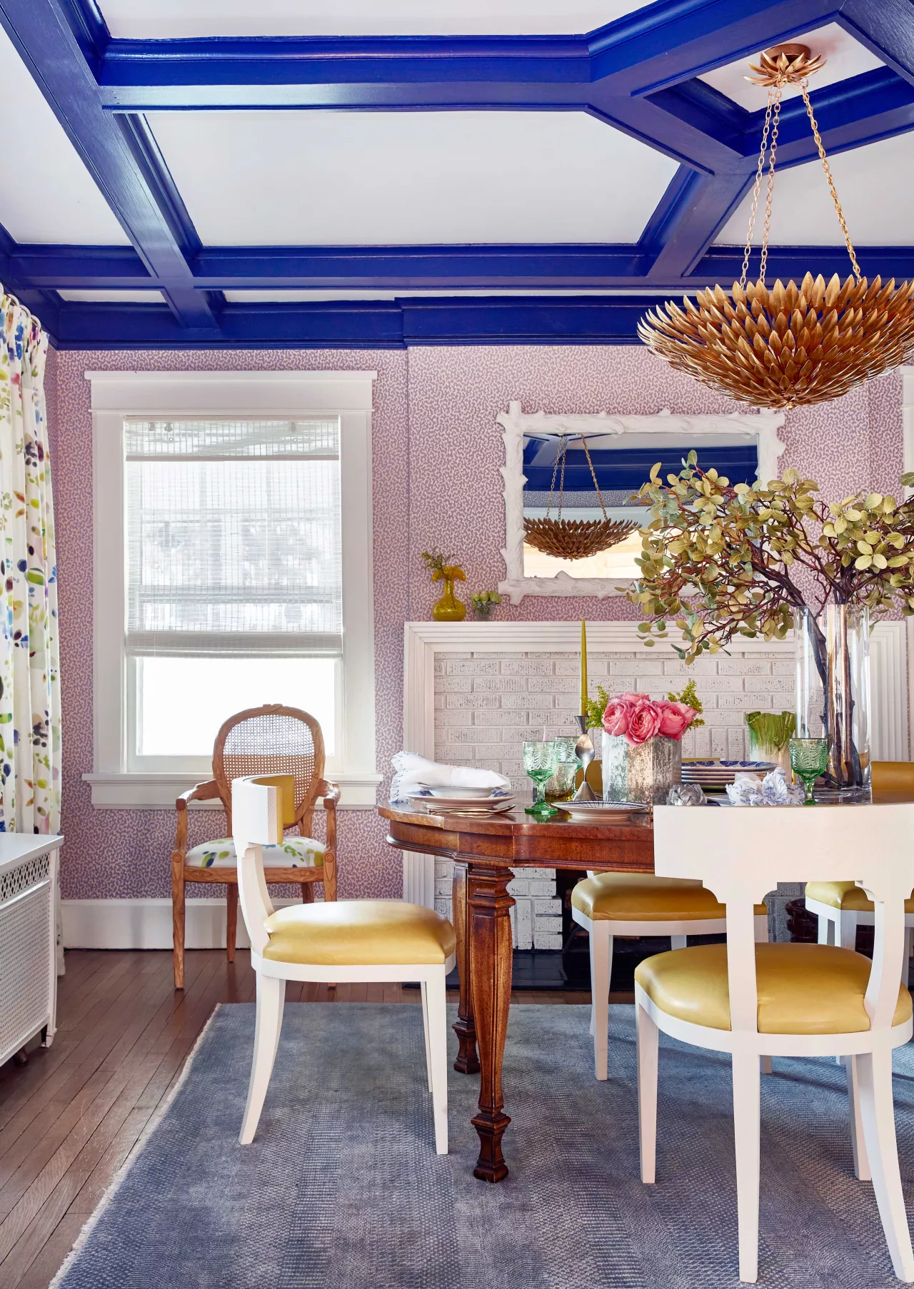
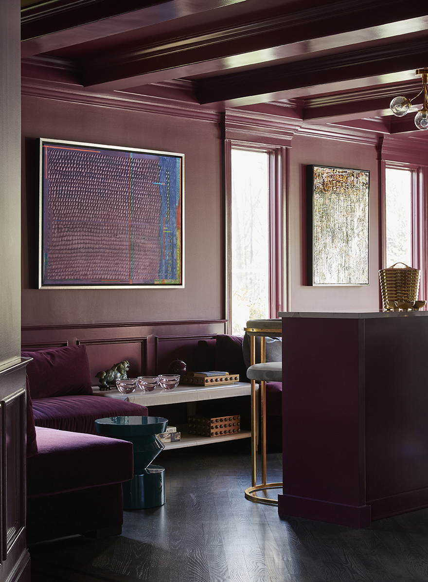
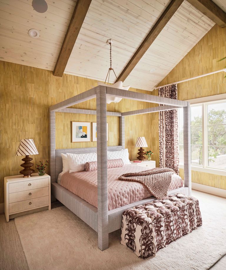
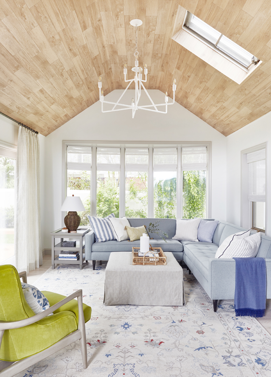
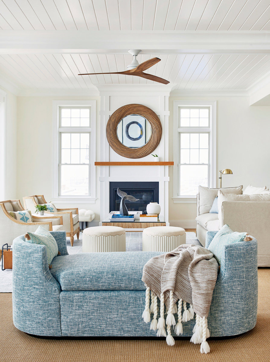
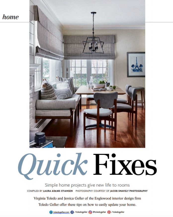
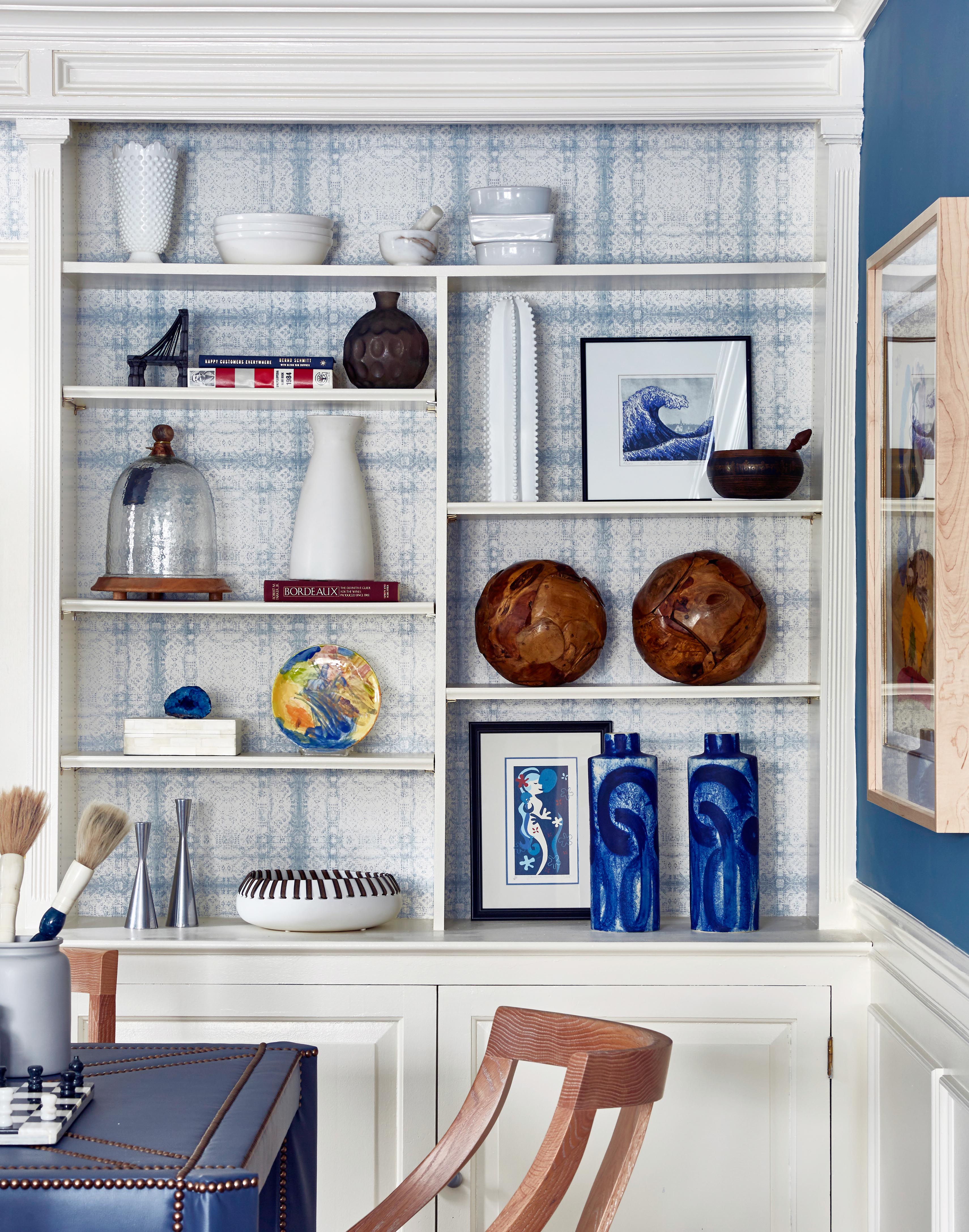
Ask any designer and a room isn’t complete without art on the walls.  More often than not it doesn’t matter what the art looks like or what the subject is (nor how much it costs!), but that it’s the right scale and proportion and that it’s hung at the right height. Too often we see too-small pieces hung too high. And it drives us nuts!  


So here’s a quick cheat sheet:  


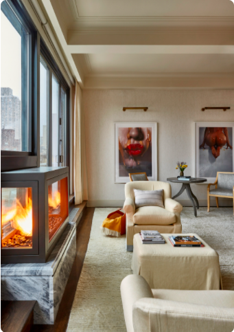
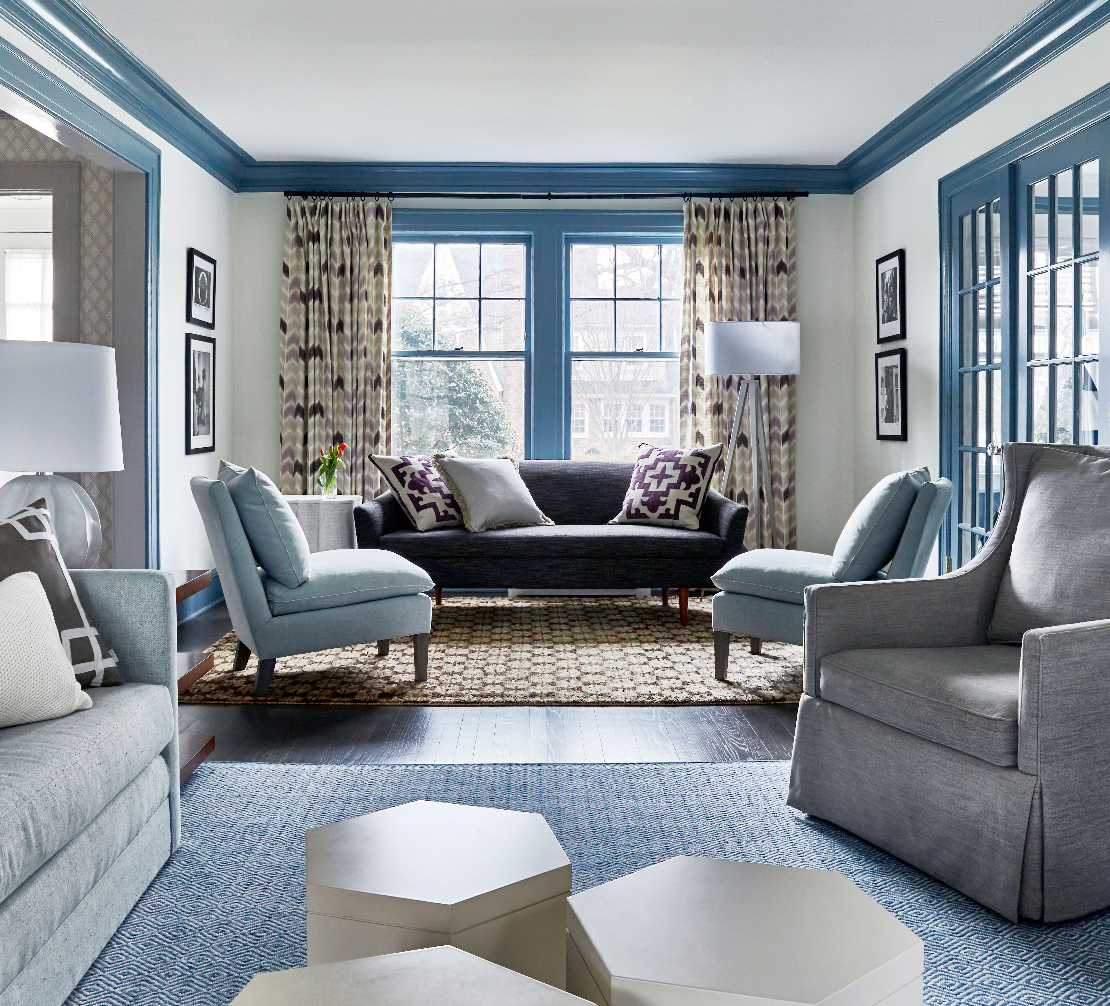
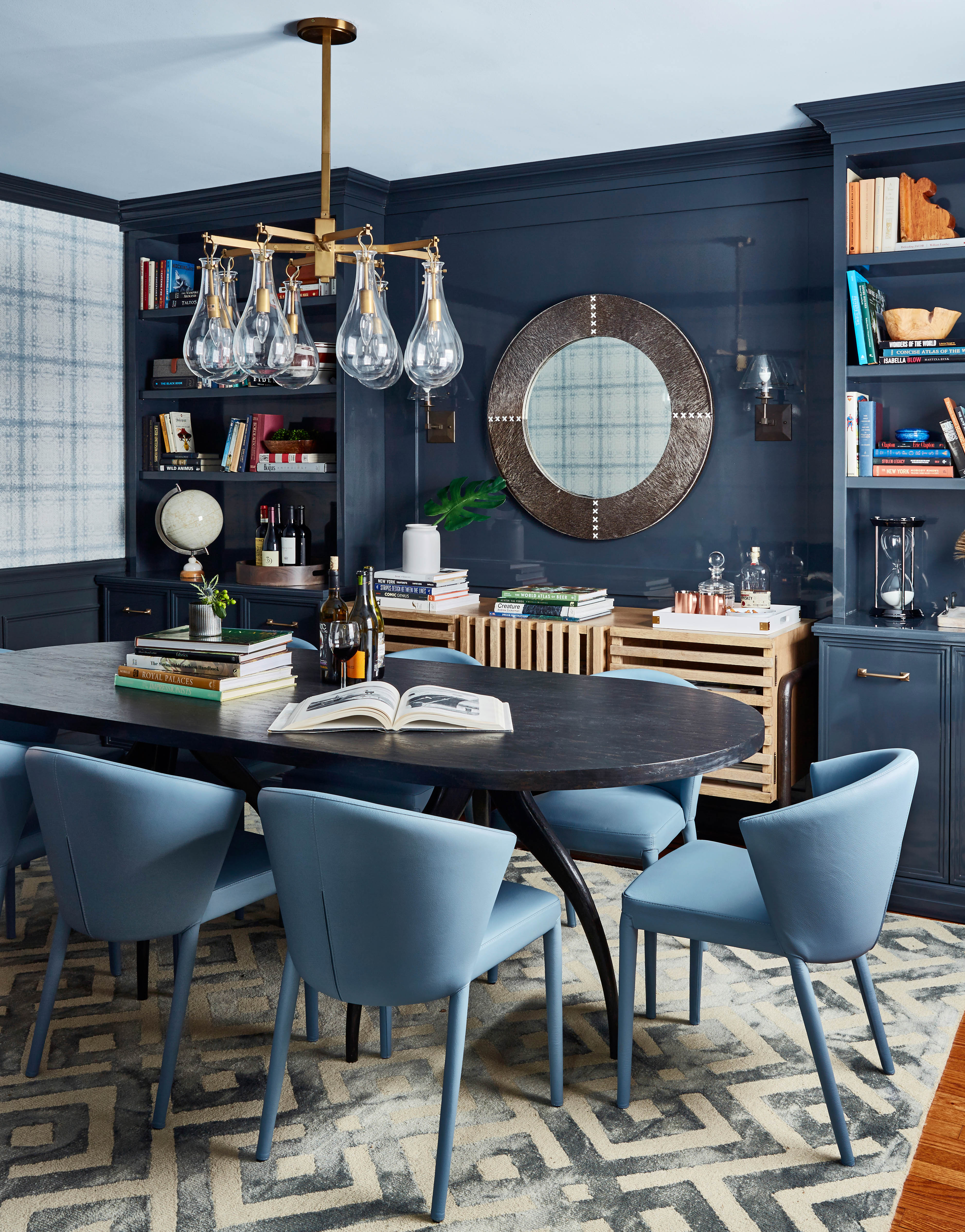
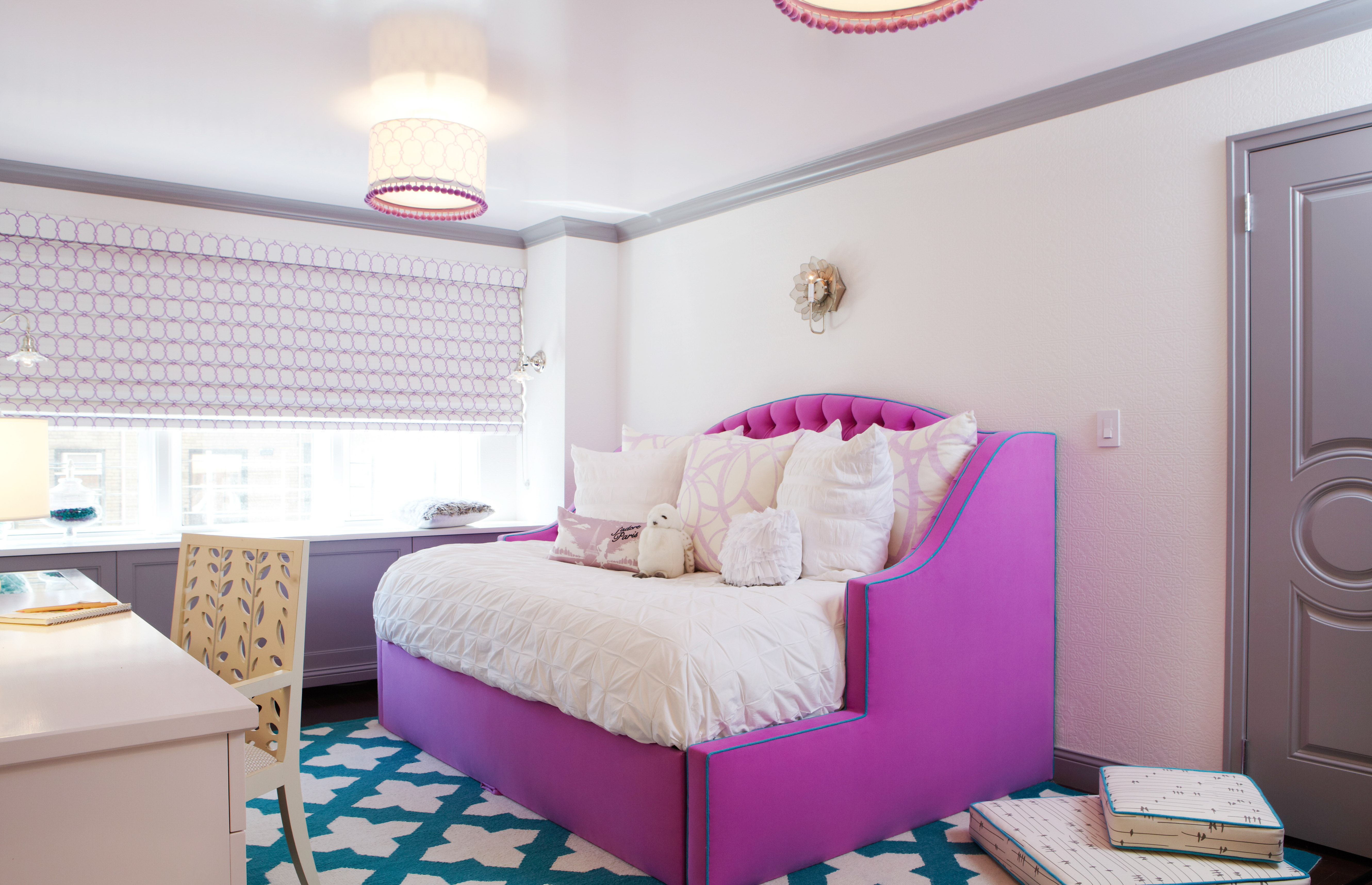
- Art should be hung at the average person’s eye level (so, the center should be just around 60” from the floor).  -

- When in doubt, oversize is better. If your art is small, you can group a few pieces together, but the “Gallery Wall” look that has been popular for a few years now has already become dated in the design world. (Although a salon hang will always be great for family photos and is best suited in your home’s private areas - going up the staircase or down a hallway).  

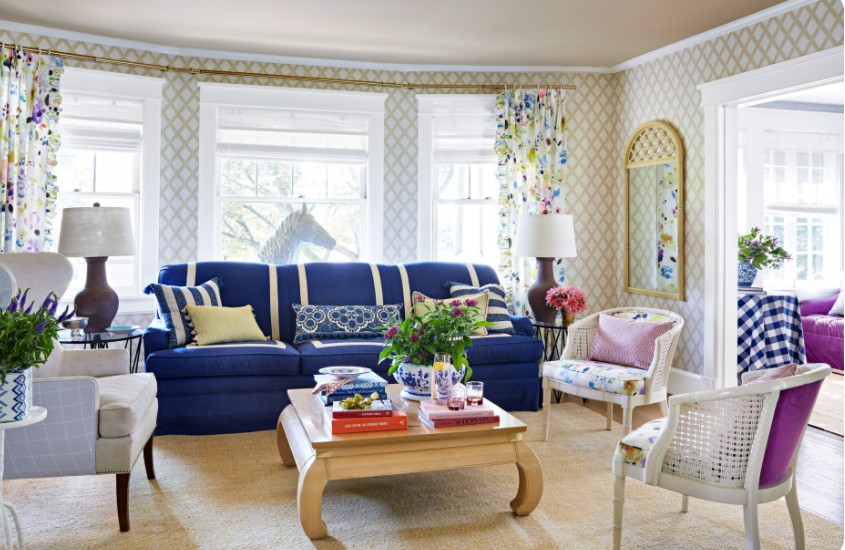
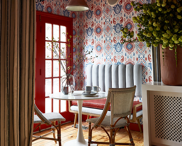
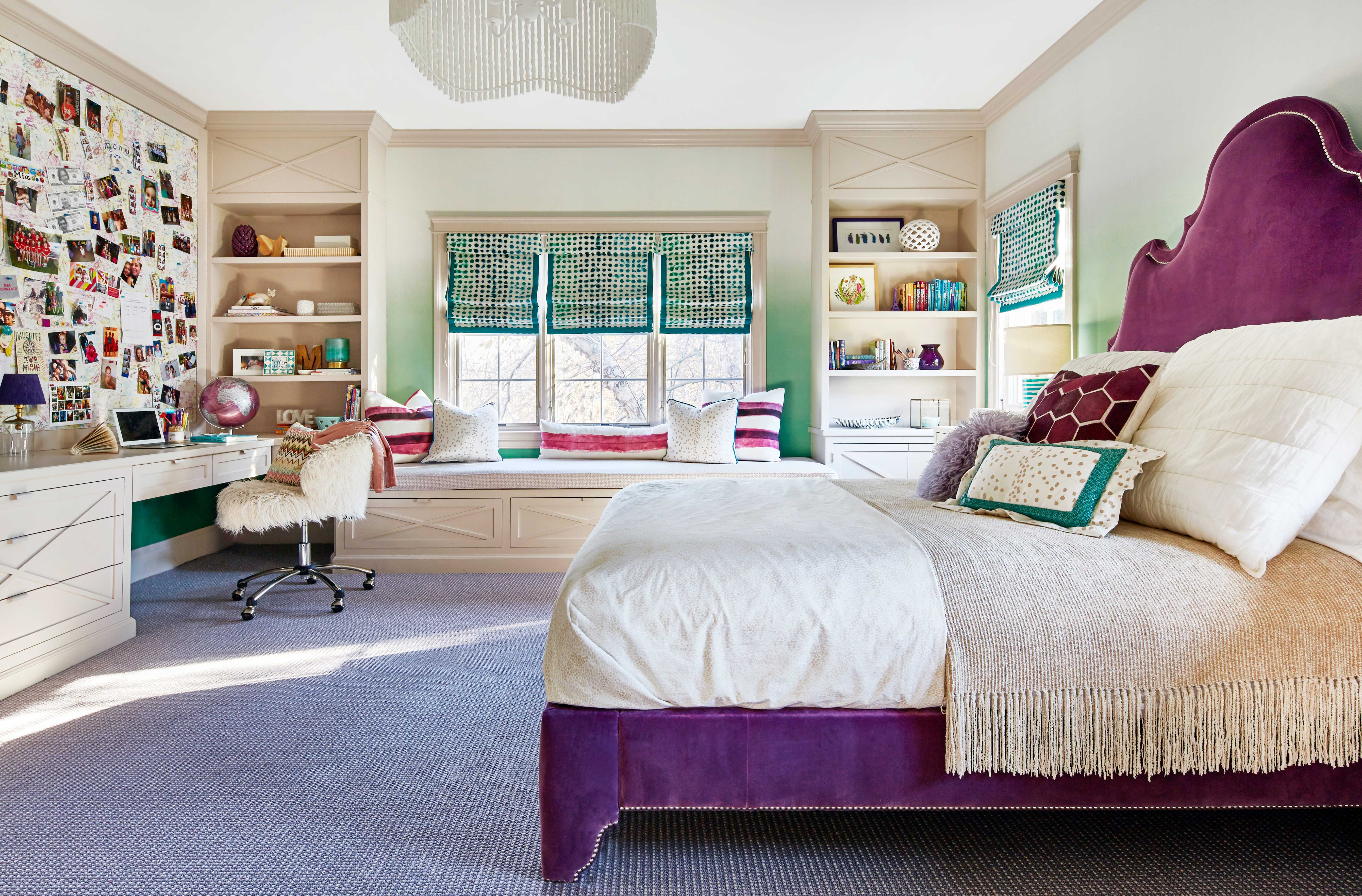
- Art over furniture should take up at least half of the sofa length, if not more. And it should be hung approximately one hand width above the sofa. 

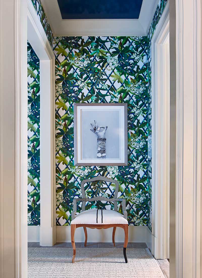
- When hanging art on a blank wall with no furniture grounding it, avoid a landscape orientation, and either choose a square or portrait orientation.  

- Of course, there are exceptions to all of these rules so our best advice is to hang it up, step back and take a photo, and try to look at it objectively.  


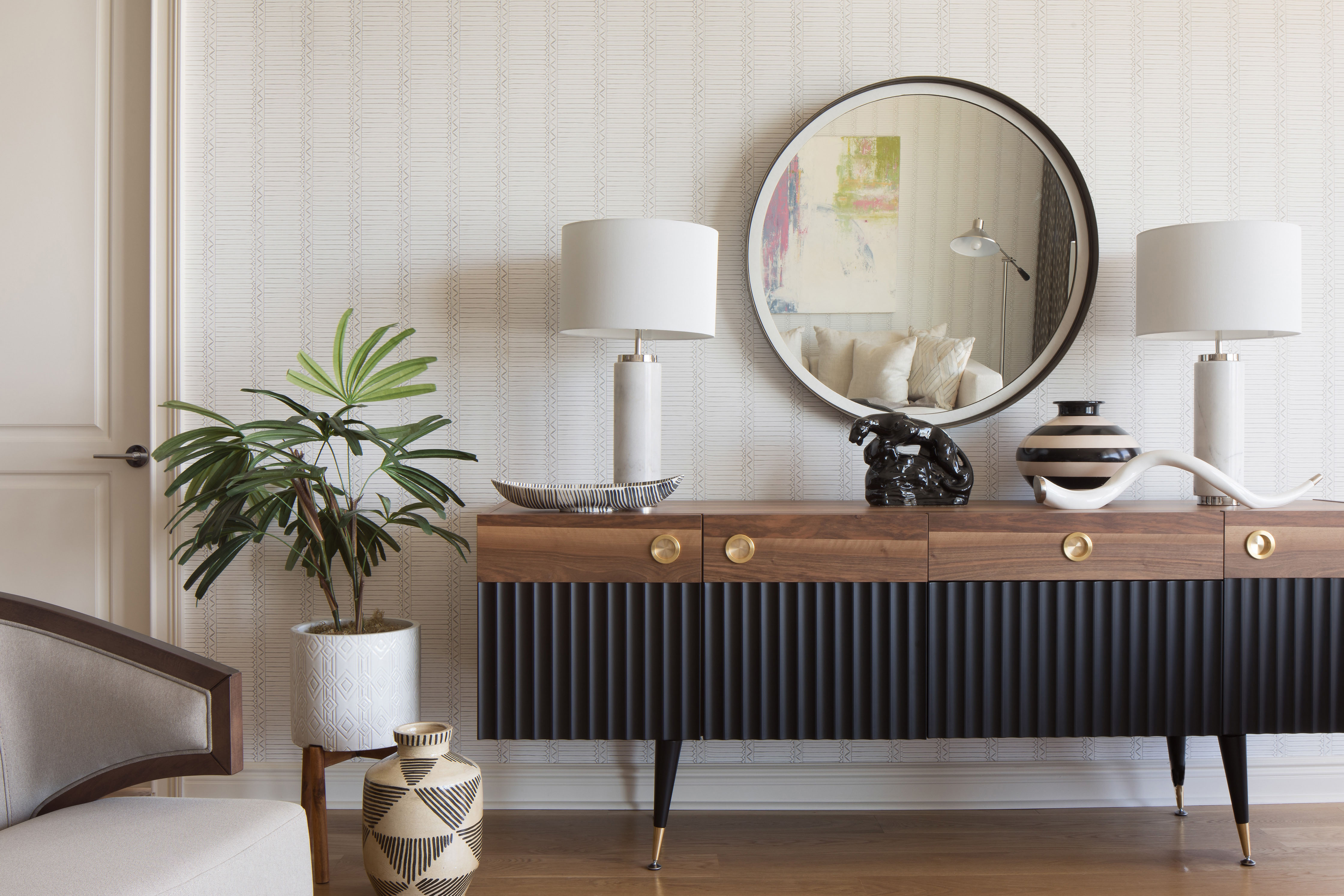
Selecting art is highly personal but collecting art can be a thrill once you figure out what makes you tick. Are you drawn to photography? Oil paintings? Abstracts? Something with texture and dimension?  


We can easily fall down a rabbit hole (in a good way!) looking for art because there are so many options – up and coming artists on Instagram or Etsy, swanky SoHo galleries, estate sales, 1st Dibs and Chairish, your kid’s painted canvas, personal items like the original blueprints to your home Our suggestion is to jump in and start researching the style you like. Once you find an artist or photographer you like, follow them on Instagram and check out the “Suggestions for You” section to find similar work.  


Your decorating gurus,

Jessica and Virginia   

Room Transformations - Before and After Photos of some of our Interiors:

If you follow us on Instagram you probably know that every Tuesday we share our #TGtransformations - before and after photos of our interior design projects. We love that House Beautiful caught on to our passion for sharing our room transformations, and covered some of our greatest before and afters on their site. The most dramatic before and afters are of course from gut renovations or projects that involved construction, but it's also pretty clear here that a few cans of paint, some wallpaper and great color and pattern can dramatically transform a space. The room transformations we share also include some behind the scenes info into our design process - like rethinking the traditional furniture layout for a not-so-traditional family, or addressing the storage needs in a home that lacks closet space. And, in case you didn't know, you can also scroll down on most of our portfolio pages to see Before and Afters there, too!

Dear Designer:


We are renovating a bathroom, and I see subway tiles being used everywhere these days. I love the look (and the price is great), but I’m concerned that it’s too trendy and I don’t want to date my house. What are your thoughts on this?


Sincerely,

En Vogue


______________________________________________________


Dear En Vogue,


There’s a reason that subway tiles are everywhere – they are classic and have withstood the test of time. (Did you ever stop to think about how subway tiles got their name? They were designed for New York’s very first subway stations back in 1904 and were created because they are bright, give them the impression of “clean” and are easy to maintain – concepts that clearly still apply today.)


In our opinion, subway tiles are timeless and will always have a place in interiors. However, you’ll probably never see us use them in the standard, white 3” x 6” size and brick-laid pattern. We like to keep it fresh, so we’ll play with the color, size, and pattern.


In this bathroom, we switched up all of the elements of the classic subway tile: we chose a grayish blue color with a beveled edge, switched up the size to one that is slightly “off” from the standard size at 3” x 9” and we played with the pattern, installing it on the vertical and with an inlaid herringbone pattern.

There are so many twists and ways to reinvent this classic. A quick Pinterest search can send you down a rabbit hole of modern installations (stacked instead of staggered), fun installations (a colored or contrasting grout), edgy installations (staggered on a diagonal) or pure classic installations (herringbone or brick pattern).


The moral of the story is don’t be afraid to use the timeless material in its original orientation or with a fresh perspective. It’s not going anywhere any time soon!


Your decorating gurus,

Jessica and Virginia

How to rearrange the furniture you already have to create a completely new interior design layout:

House Beautiful tasked us with rearranging the furniture in a living/dining room and give it a brand new look and feel, and we were up for the design challenge! Our clients already had great pieces of furniture, but the arrangement wasn't working in the open plan living room and dining room combination space, so we "shopped their home" and pulled in a few other pieces of furniture from other rooms in order to complete the look. With some twists and turns of a sofa, a loveseat/banquette we created a more casual dining area, an open seating area that invites you in, and by tweaking some of the finishes in the space the overall feel is much brighter and airier.  Scale of furniture is so important in design. The coffee table that was originally in the room was an appropriate size for a suburban house, but in this condo apartment it was taking up too much space, visually and physically. We also added large scale art over the sofa to bring in some interest on the wall and a pop of color. Forget design on a dime - this was design for free by using what you've got! Click through to watch the full reveal on House Beautiful's website.

House Beautiful Next Wave Designers!:

We couldn't be more thrilled to share that we have been named in this month's issue of House Beautiful as the "Next Wave" interior designers. It's been a long journey here (we posted a little bit about it on our instagram feed) that started as a pipe dream in our first design studio over 8 years ago.  We are so excited to be recognized for our hard work in the renovation and decoration of homes in New York and New Jersey. But, as usual, we are too busy to sit here and relish too-too much in our successes and it's already on to the next design project! We are elbow-deep in designing an adorable Cape Style house in Northern NJ that will have a touch of Scandanavian, albeit timeless and contemporary, design. So, as they say, on to the next one, on to the next one.

Dear Designer:


I look at images on Pinterest and I’m always in awe of the window treatments – they always
seem to pull everything together. Any pro tips you can share?


Signed,
Hanging In There


__________________________________________________


Dear Hanging In There,


Because window sizes vary so much from house to house and room to room, custom window
treatments are an obvious choice to bring in character to your home since there is never a one-
size-fits-all answer. Most of the images you are pining after are probably custom, in fact. You
can get a great bang for your buck by pairing simple and neutral furnishings with patterned and
colorful fabric shades or drapes to get an overall unique design.


The pro tips:


Don’t hang drapery right above the window, and never, ever mount the drapery rods on the
crown molding. A well known trick is to hang drapery a bit above the window trim (the higher
the better) which will make your ceilings appear taller than they really are.


Make sure that your drapes are wide enough. If you’re purchasing ready made drapes from a
mass retailer, always go for their wider width if they offer two sizes, and if they don’t, stack two
pairs side-by-side to give the illusion of one full curtain. And, speaking of the ready-made route
– we love adding trim details to a simple or solid curtain panel to add a bit of excitement.


Make sure your curtains go all the way to the floor, but don’t let them puddle too much. An
ideal length just breaks on the floor, but a couple of inches longer is ok, too. But please don’t
make them too short!


Layer up – drapes plus shades (woven, wood blinds, or a fabric roman shade) equals high style.
Our last tip, and maybe most important, is that form always follows function, so if you need
window treatments for privacy, sun protection or blackout (hello, early risers!) tackle that issue
first and then address the “look.”


Your decorating gurus,
Jessica and Virginia

Interiors Styling Tip:

The holidays are literally just around the corner which means so is holiday entertaining. One of our design clients called us with a request to get her home ready for family and friends. All of our projects include accessorizing, because an interior design project is just not complete without that final layer, but after 6 years, our client was asking for a little freshening up. We worked with some of our original accessories, peppered in some new dishes, vases and glassware, and incorporated some of her family heirlooms. Custom millwork is a huge part of our interior design work (in fact, scroll through almost any of our projects and you are bound to see built in cabinetry that is custom designed for each client) but staging those open shelves takes so. much. stuff. We have our clients fill out a lengthy interior design questionnaire when they begin working with us so we can learn about some of their hobbies and likes, and fill their homes with a few new things that mean something to them. On a recent lunch date with a client we learned that we share a love of Justin Timberlake so we happily added his new book to her home accessories list (because we love a good coffee table book, and we love a good sense of humor! I ordered one for myself at the same time too, naturally). On installation day we ask our clients to lay out any accessories that we are free to use (old wedding gifts are a popular one!) and we rummage through their cabinets and pull out knick-knacks and tchotchkes that they might not have even thought of using. Once we have all of the objects we clear away any clutter so we can start with a clean slate, and we add, subtract, and add again, until we have a layered, textured and varied end product. Most of our clients keep their shelves exactly the way we left them, even if years have passed since we originally staged them. And those clients get an A++.

Dear Designer:


I love our living room – it’s a great size, but it’s really long, so I can’t figure out how to place my furniture! Anywhere I try to put the sofa seems to cut off the room, but I love an open and airy feel. Can you help solve this design dilemma?


Sincerely,

Lost in Design Space


______________________________________________________


Dear Lost in Design Space,


We hear you! So often people are challenged with rooms that boast a great deal of square footage but go against the tried and true living room furniture set up of a sofa and chairs.


The natural inclination – a sectional sofa – is the quintessential answer to comfortably watching television for the modern family. We love our sectionals! But if the space isn’t right for a sectional, it takes up too much visual space and can cut off a long room because you are forced to look at (and walk around) the back of it.

We recently tackled a similar problem in an 1800s Federal home which had our client scratching her head. We got pen to paper to fulfillher wish list of both comfy family time and easy entertaining.


To tackle the length of the room we set out to create two distinct zones – a cozy every-day area to watch TV or hang by the fireplace, and another seating zone set up for entertaining. The key to unifying these areas came by way of a custom tete-a-tete placed in between the two zones. The design of the piece is such that you can sit on either end and be a part of either zone. Bonus? It’s also wide enough to lay on and has been proven to be a great place for a midday snooze.


So, in thinking about your long living space, think about the function of the room – how do you want to use it – and incorporate flexible furnishings in the center that can support a zone on either side – a daybed, chaise, or swivel chairs usually do the trick!


Your decorating gurus,

Jessica and Virginia

Interior Design for the Generations:

We were asked by our good friends at Aspire Magazine to be part of their Long Island Design Tour and sit on a panel moderated by LuAnn Nigara of the famous Podcast, A Well Designed Business,  representing the Generation X demographic to give our insight as to what that generation needs and wants in kitchen design. The venue, The Breakfast Room in Manhasset, Long Island was gorgeous...and, don't you just love their name? The Breakfast Room, ahhhh. Along with Generation X, the Millennial and Baby Boomer generations were also represented.

We have designed many kitchens in our collective nearly 20 years in design and have designed for many Gen X'ers and baby boomers and recently worked with our first Millennial couple. So, how does kitchen design change for someone based upon their age group? Some of the answers we knew very quickly but we took to one of our favorite Facebook Moms Groups, Hoboken Mommies, and asked their opinion and boy did they deliver.

What we see is that Gen X'ers are in the most busy times of their lives. Typically they have recently bought their biggest home, they are the pinnacles of their careers, their homes are filled with children and pets, college costs await - you get the picture. In their kitchen, they are looking for timeless design are often timid about being daring with color and finishes because this kitchen will be theirs for a very long time, until it's time to downsize. Our Facebook Mommy friends all said they want efficiency which means lots of drawer cabinets outfitted with organizational accessories and refrigerator drawers (for little ones to stockpile their juice boxes and water) and dishwasher drawers to make washing smaller loads a breeze. They don't want too much tech but smart refrigerators that can maintain a grocery list that links to your phone app and smart double ovens reign supreme.

Whatever your age group, we find that your kitchens can truly be customized to work for your current life and what is valuable for you in that chapter of your life. Cheers!

Dear Designer:


Every year, I say that this is the year I’m going to get my act together and finish my dining room before the holidays … and here I am again, with Thanksgiving just around the corner and my dining room is still a hot mess. My biggest struggle is that I’m not a formal person, but my dining room has a formal set-up. How can I make the room feel more appropriate for me?


Sincerely,

Formally Challenged


______________________________________________________


Dear Formally Challenged,


It’s scary how fast those holidays creep up, isn’t it? Feels like we were just relaxing at the pool, and now here we are, knee deep in homework and sports teams again. We know that the panic of family hosting is real. The fall is always the busiest season in the design world, too, and we’ve been getting those threatening emails from manufacturers pressuring us to get our orders in to meet Thanksgiving and Christmas deadlines since July!


We are firm believers that you have to make your home work for you, so if you are not a formal person, just abandon the idea of a formal dining room! We love creating a study/library vibe in dining rooms for kids to do homework and projects at, and if there is enough room, we add a love seat or sofa for relaxing, for evenings when you’re not even using the room for dining.


But if that’s not right for you, you can simply consider using color and pattern to make the room feel livelier and more youthful, and more you. This should help create an atmosphere for you to feel yourself. You can also make it more casual by mixing up the seating – think a banquette or bench along one or both sides coupled with head chairs.


Trust us, it’s ok to abandon the idea of a crystal chandelier and a matching dining set – that’s just not realistic to most young families’ vibe anymore! In this home, we used a fixture with a traditional candelabra shape but done in dark metal finish for modernity and coupled with globe bulbs instead of a faux candle shape bulb (this designer tip can be applied to give any candelabra light a fresher look).


Being your authentic self is a phrase we hear a lot in 2018, and it applies to your home life, too!


Your decorating gurus,

Jessica and Virginia

Dear Designer:


If you could add one element to a home to change the way people live, what would it be?  


Signed,   

Short and Sweet


______________________________________________________


Hey Short and Sweet!


Hands down, banquette style seating is both our most often requested, and suggested, design element. Almost every home has a natural area to build one in, whether it’s a nook in a kitchen corner, or a long stretch along a dining wall. We’ve even made the argument for a built-in banquette Our clients love them because they allow us to be casual and intimate during meals, cocktails, hot cocoa, crafts projects or homework.  


The gift of design! You’re tugging on these designer’s heartstrings! We love creating spaces for kids to thrive in, give them a sense of pride about, and to help teach them responsibility for their own belongings. And we love that you’re thinking this way for the holidays – it’s so creative and the impact will be long lasting. Kudos to you!  


Last Christmas a client came to us with a similar request – her tween daughters had long since moved on from snuggling with mom and dad in a rocking chair, and now they wanted a place to ‘host’ their girlfriends. A tufted turquoise chenille sofette suited the older girl’s bedroom and style, while a faux-fur daybed was perfect for the little girl. Mom and dad have since gushed to us about the pleasure they see in their daughters’ self-confidence when they “entertain” their friends in their own personal spaces.  


Alternatively, the biggest and broadest impact can be made on the walls or ceiling – a jaw dropping wallpaper or mural that expresses your child’s unique style  - an ocean wave for a kid who’s laid back, a dip-dye rainbow for a budding artist, or an animal motif for an aspiring vet.  


A special first piece of art – it doesn’t need to be an “investment” piece – is an amazing gift and a special experience for kids to learn about curating their own collection Another client of ours gave their sons framed photography that is meaningful to them – Kurt Cobain’s converse sneakers, a striking view of an empty Yankee stadium and an aerial shot of a rooftop basketball court. When we came to visit the boys beamed with pride as they gave us a tour of their budding collection.  


You can also give them a practical gift – a desk, a bulletin board, a new bed – kids value being treated like adults and relish in gifts like these. And what a great gift for you to give and receive!  


Your decorating gurus,  

Jessica and Virginia     

How to make your lifestyle and your home design compatible:

We were thrilled to pick up the newest issue of (201) Magazine and once again see our work featured! We've been turning to this project time and time again to urge our clients to take a moment and consider how they truly live, and design their home to work for them. When we met this wonderful Tenafly, NJ couple, their dining table was covered in science projects, art projects and homework. Covered! It was clearly the hub of their home, sandwiched between the front door and the side door, and in close proximity to the stairs and the kitchen, making it a room that gets passed through multiple times a day. It had been sitting unfinished since they moved in years ago because they felt that they couldn't turn it into the formal dining room that it is "supposed" to be when it is a high traffic zone, and a family control center. We pushed them to lose the strict constraints that they were putting on themselves to create a formal space and to embrace their full and hectic lifestyle with a 'tween and a teen. We set out to create a casual but layered room with a large table that can accommodate homework OR dinner and have both feel completely appropriate. Click through to the article in the October issue on page 48 to read more of our tips including a few quick fixes like wallpapering the back of a bookcase, defining areas in open concept floor plan by way of lighting, and selecting the right shape and size tile for a bathroom renovation.

Innovation in Design Awards:

We are absolutely thrilled to announce that we are FINALISTS in the Bath Design category for New York Cottages & Garden's Innovation in Design Awards. The awards are being presented by One Kings Lane on October 24th at The Rainbow Room, and the evening honorees are Mitchell Gold Bob Williams. The bathroom we are nominated for is the black + white jewel box in our Postwar Panache project on the Upper East Side. We are so honored to be among such great company and look forward to celebrating!

Ask the Interior Design Experts:

We're back, and we're answering a design question  from a viewer who found us on You Tube all the way in Israel...we dish out advice on their furniture placement and wall color. If you want to dip your toe into the design world and have a question you want us to answer on Facebook or Instagram Live, or You Tube, reach out to us! We always have a little too much fun with these webisodes!

Edgewater's The Glass House: an Interior Design Showhouse:

Large expanses of glass and super clean lines are what make so many of the new construction river side buildings like The Glass House in Edgewater, NJ desirable. Putting our brand’s luxuriously livable stamp on the modern apartment in under four weeks was the challenge ASPIRE DESIGN AND HOME magazine presented us with when they graciously invited us to be a part of their showhouse. Read all about our design process here, and for more images of this showhouse and more, check our Charity Showhouse portfolio page.

Design Project Reveal:

Postwar Panache: Seven years ago we designed and managed the construction process of a 2 bedroom 2 bathroom complete gut renovation on the Upper East Side in New York. We had designed the apartment with the thought in our minds to eventually combine it with the studio apartment next door, and many years later, our clients called us back to seamlessly merge the two.  Our interior design firm handled the entire project from start to finish including all of the construction plans, project management of the general contractor and all the way down the decorating (from furniture to fluffing pillows and filling decanters). Hear all about the inspiration and process here.

Interiors Styling Tip:

The #SHELFIE. You've probably heard this tag line a time or two if you spend any time at all on social media. But what's the buzz all about?! And why the heck are people so concerned with their shelves? Well, because they should be, if you ask us =) The styling of your home is the final layer in bringing a design together. When challenged with rows upon rows of bookshelves as we often are, its easy to become overwhelmed with how to curate the shelves without making them feel overstyled or impersonal. A quick takeaway as a starting point is to corral similar objects together and display them in groups on the shelves. Disparate objects should then be feathered in in between the groupings for balance. Feel free to go crazy with new decorative objects, but don't forget to incorporate momentos or keepsakes so that your #shelfie is just as personal as your #selfie!


Interiors Styling Tip:

Be BOLD. We love when a front door speaks to the people who inhabit the home. What do you think this fierce lion's head knocker says about the family who lives here?

Interiors Styling Tip:

Where do you start? That's probably the most common question we hear from clients when we approach a room design. The short, simple answer is with the floor. Yes, we spend plenty of time understanding the function, architecture and mood of the room before we even consider looking at finishes, but when we're ready to do so, we start with the floor plane. All the research we did beforehand will inform our decision as to whether or not this room will have bare floors, wall to wall carpeting or the perfect rug. From there we scour our options and have those options be the driving force for all of the other things we choose in the room. A faded antique rug may influence us to choose a pillow with beautiful fringe and a plaster fixture with a gold finial, while a bare white oak matte finish floor might have us pulling simple, sculptural accessories and Milo Baughman chairs. So when you don't know where to start, look down!

Ask the Interior Design Experts:

Sit down with us while we dissect some write-in reader decoration dilemmas, from when it's ok to paint crown moldings, base moldings, and window trim in different colors, to some space planning, window treatments and bedding help for a master bedroom overhaul. And while you're here, please subscribe to our YouTube channel so you don't miss any more of our Ask the Experts series!

Pantone's Color of the Year: Ultraviolet:

Why we often use purple (or several shades of it) for tween and almost-tween girls. Read all about our use of Ultraviolet, Pantone's color of the year for 2018 in (201) Family. Scroll to page 14.

Interiors Styling Tip:

Designer showhouses are where interior designers get to shine. We take risks (jungled themed trellis wallpaper, anyone?), push limits (hand painted faux bois ceiling), and hope to inspire our visitors. Read about our NJ Designer Showhouse in Saddler River in (201) Magazine on page A26. #gobigorgohome

Design on a Dime:

This was our 4th year participating in Housing Work's annual Design on a Dime event, where top interior designers are challenged with creating a shop-able vignette entirely from donations, and all proceeds helping those affected by HIV and AIDS. It's a mad-dash to the finish line, for both installation (we get 1.5 days and when the bell rings we have to drop our tools!) and for shoppers (every year our art is snatched off the walls within minutes!). See photos from the event here.

Interiors Styling Tip:

The energy and excitement before the holidays is pure JOY. We love helping our clients prepare to welcome family and loved ones for the season and where better to do so than on your front door? Wreaths can be untraditional (and nondenominational) and we love having fun with holiday decor!